

The best neutral paint colors can make a room feel brighter, calmer, or more inviting while giving you flexibility to change furnishings and accessories over time. The right shade depends on the room’s natural light, existing finishes, and the atmosphere you want to create. From cool grays to creamy whites and deep accents, these options offer a practical starting point for planning a home’s color palette.
How to Choose the Best Neutral Paint Colors
Neutral paint is not limited to plain white or beige. Undertones influence how a color appears: a gray with a cool, blue-based undertone can feel crisp, while a warm neutral may look softer and more relaxed. The same paint can also appear different throughout the day as daylight and artificial lighting change.
Before committing, test sample colors on the wall or on movable boards. Look at them in morning and evening light, and compare them with flooring, countertops, trim, and furniture. This simple step can help reveal undertones that are easy to miss on a small paint chip.
Cool Neutrals
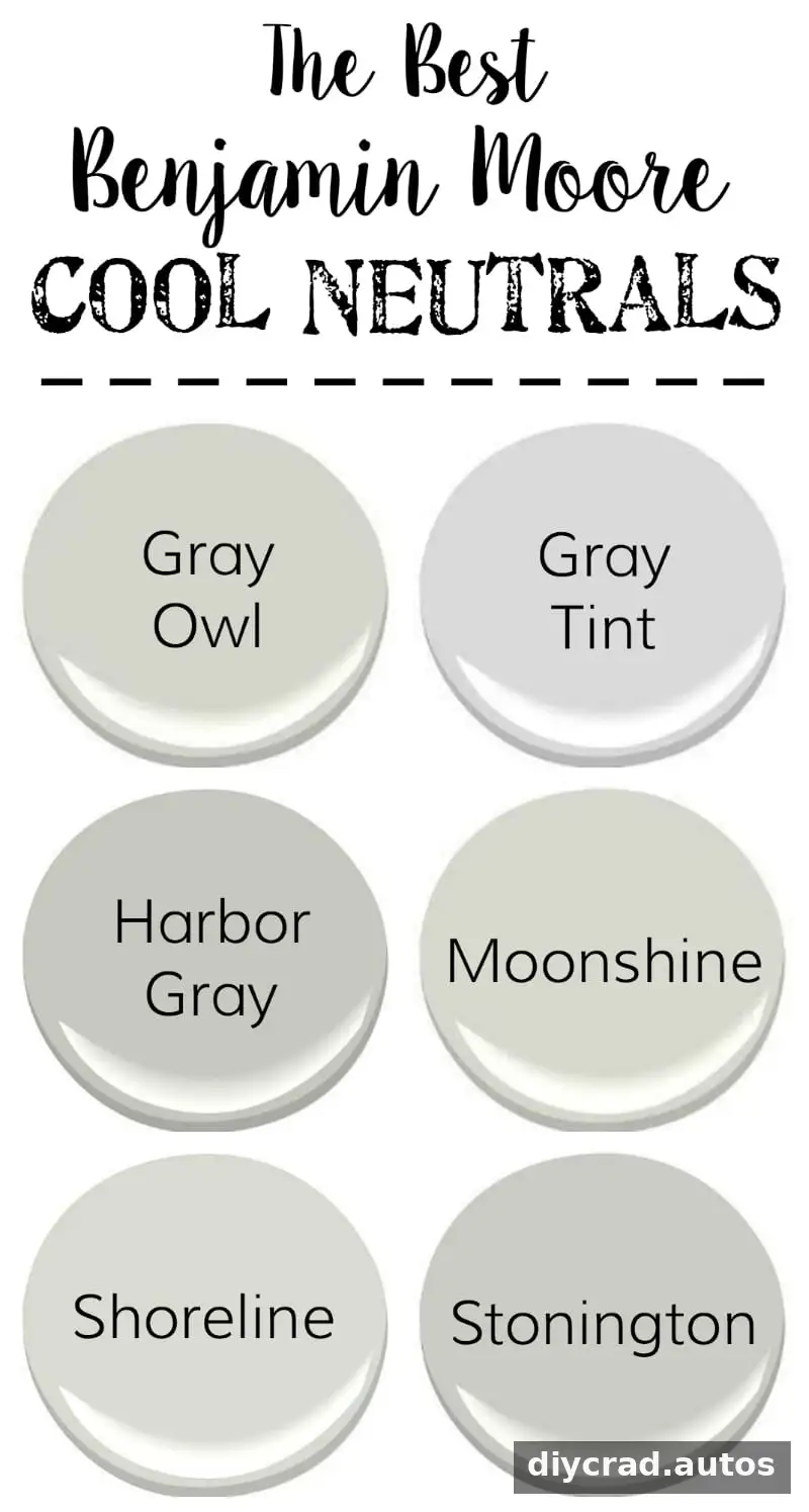
These six cool neutrals are useful when you want a gray with a blueish undertone. Cool grays can create a clean, contemporary feel and work well with crisp whites, blue accents, and many natural materials. They can also provide a quiet backdrop for colorful decor.
Check how much natural light the room receives before choosing a cool gray. In a north-facing or dim room, some shades may feel cooler or darker than expected. Compare samples against the room’s fixed finishes so the wall color does not clash with their undertones.
Warm Neutrals
These six warm neutrals are not quite tan, but their warmer undertones can sit comfortably alongside gray shades. They are a good option when you want a room to feel welcoming without choosing a strongly colored paint. Warm neutrals can also soften spaces with wood floors or furnishings.
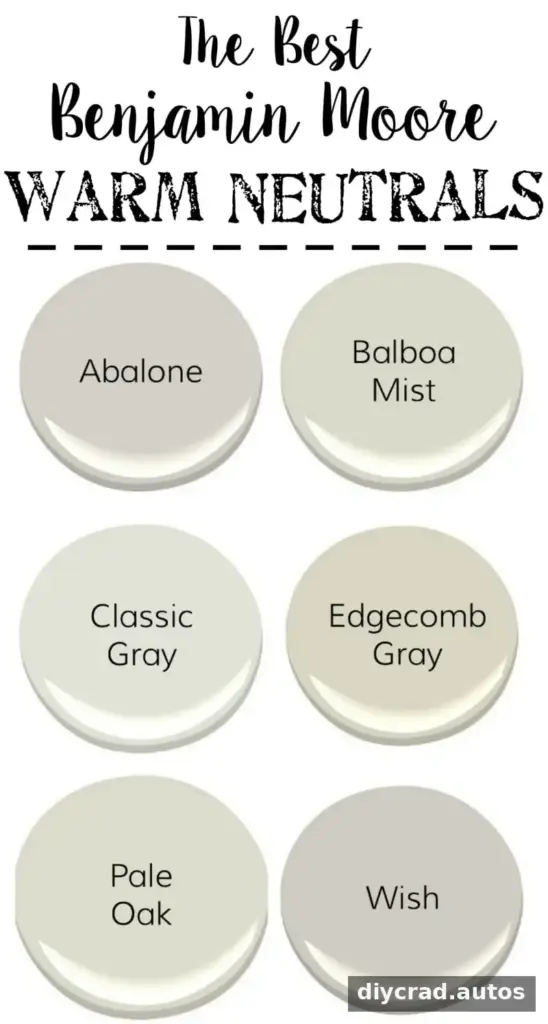
For a balanced palette, compare the warm shade with nearby gray paint, fabrics, and flooring. A neutral that looks subtle by itself may appear more yellow, pink, or beige beside another color. Testing samples together can help you see whether the combination feels cohesive.
White Paint Colors
White paint can refresh cabinets, walls, or trim, but different whites have noticeably different undertones. Some appear crisp and bright, while others have a creamier quality. Swiss Coffee is described as a softly creamy white that can brighten a room while retaining a warm, welcoming look. Simply White is a brighter option for trim and can pair well with cream tones.
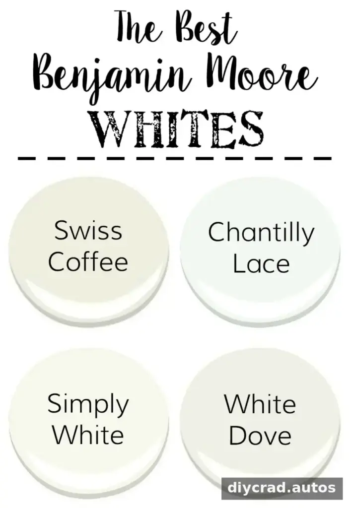
When selecting white paint, compare it with the surfaces it will sit beside. A white wall may look different next to existing cabinetry or trim, so testing both colors together is especially helpful. For a consistent finish, check sample colors in the room’s actual lighting before painting larger areas.
Dark Neutral Paint Colors
Deep neutral shades can add contrast and visual depth without requiring a full room to be painted dark. These four options can work as accents on doors, selected walls, or other architectural details. Wrought Iron is a deep shade described as darker than charcoal, with more dimension than a straightforward black.
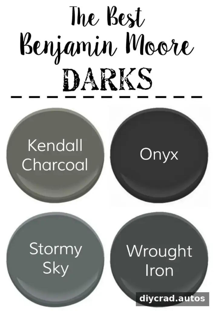
Dark paint tends to make a stronger visual statement, so consider using it where you want to draw attention or create contrast. Test the color near the trim and adjacent wall paint, and consider how the room’s lighting affects its appearance. A small painted area can help you judge the effect before covering a larger surface.
Planning a Neutral Paint Palette
A cohesive palette does not need to use only one kind of neutral. Cool grays, warm neutrals, whites, and dark accents can work together when their undertones and proportions are considered. Use lighter shades to keep a space feeling open, and reserve deeper colors for details where contrast is useful.
- Test paint samples in the room rather than relying only on a color chip.
- Review samples at different times of day and under the room’s usual lighting.
- Compare colors with permanent finishes such as flooring, counters, and cabinetry.
- Use the same sample conditions when comparing several shades.
The best neutral paint colors are the ones that suit the light, finishes, and mood of your particular space. Sampling cool grays, warm neutrals, whites, and darker accents side by side makes it easier to build a balanced palette and choose a shade you will be comfortable living with.