
Navy blue paint colors bring depth and character to a room while often working much like a versatile neutral. The right shade can feel classic, dramatic, or calm depending on its undertones, the surrounding colors, and the light in your home. Because navy can look quite different from one room to another, sampling shades before painting is an important part of choosing well.
Where to Use Navy Blue Paint
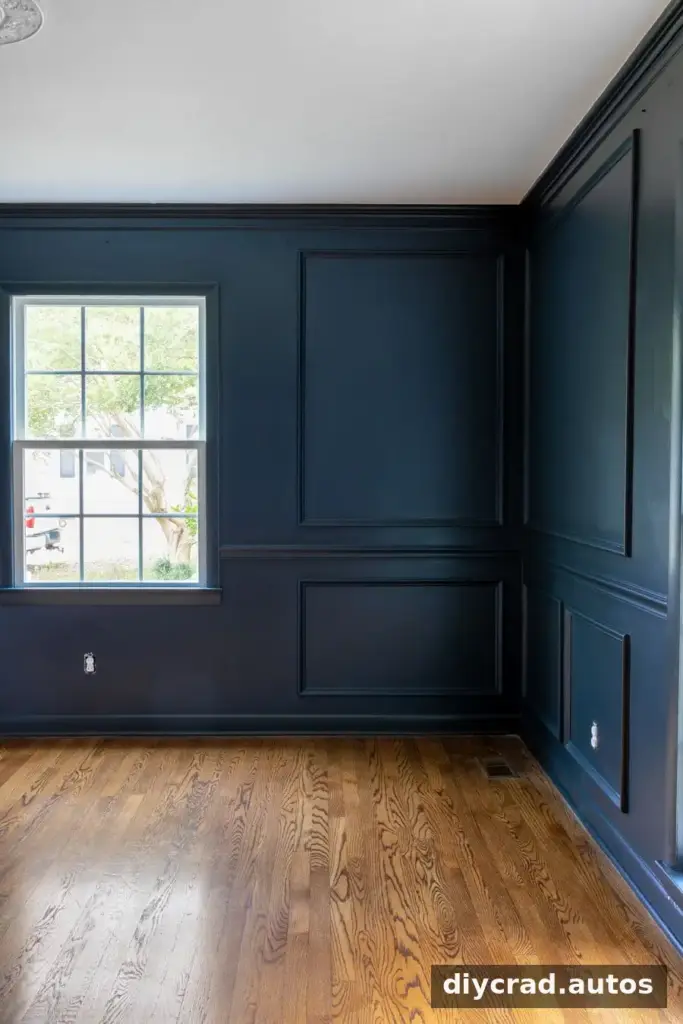
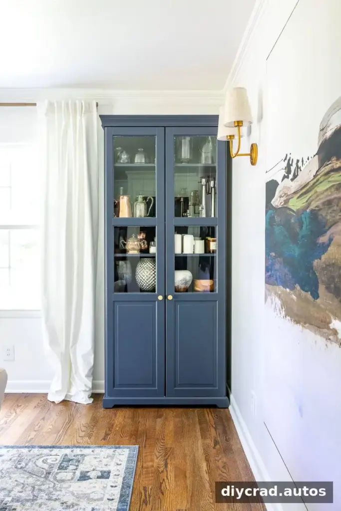
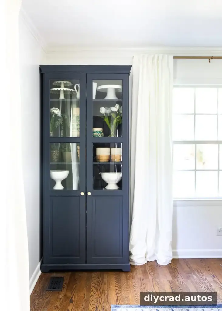
Navy can suit a range of spaces, from bedrooms and home offices to living rooms, bathrooms, and accent walls. It is also a popular option for kitchen cabinets, islands, furniture, front doors, and exterior siding. A smaller feature such as an island or door can introduce a strong color without covering every wall.
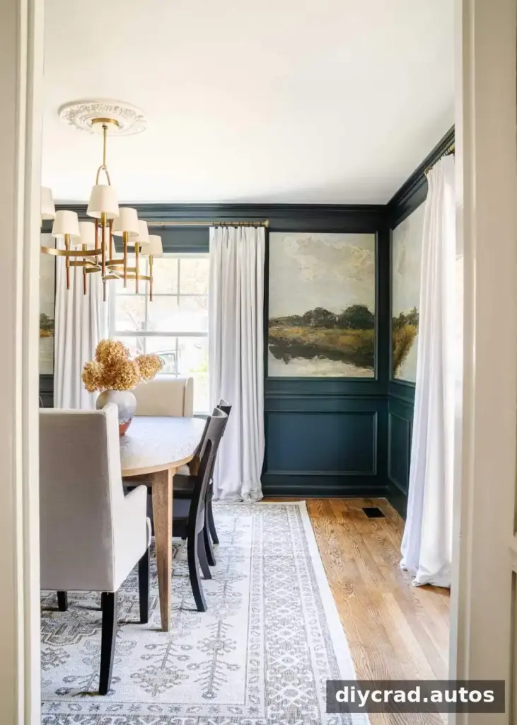
Consider the room’s natural and artificial light before settling on a shade. In a dim space, a deep navy may appear nearly charcoal, while crisp white trim can make the blue feel more vivid. For a balanced result, compare the paint with the room’s flooring, fabrics, and other fixed finishes.
The shades below range from smoky and gray-leaning to brighter and more saturated. Undertones are useful clues, but the color sample in your own space is the best guide.
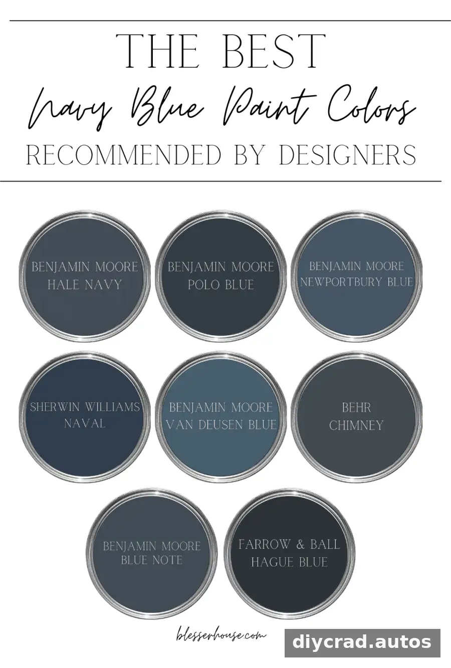
8 Navy Blue Paint Colors to Consider
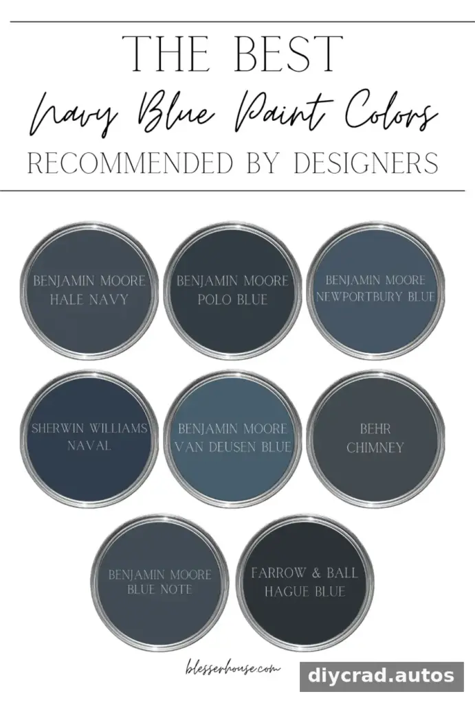
These options include classic dark navies as well as blue shades with gray, green, or purple influences. Use the descriptions to narrow your choices, then test your favorites at home before buying paint for the full project.
1. Benjamin Moore Hale Navy
Hale Navy is a rich, classic navy with a subtle gray influence. That muted quality can help it pair with a variety of decorating styles and color schemes. Consider it for an accent wall, statement furniture, or a full room when you want a bold but composed effect.
Practical tip: Place a sample beside your trim and nearby fabrics to see whether the gray undertone works with the rest of the room.
2. Benjamin Moore Blue Note
Blue Note is a deep, moody blue with a complex mix of black and navy. Against crisp white, it may read as a more vivid, almost royal blue. Its depth can make it suitable for both brighter and dimmer rooms, although the final appearance will depend on the specific light.
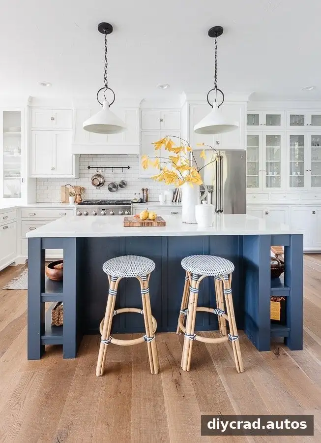
Source: Lilypad Cottage
Practical tip: Check this shade in both daylight and evening lighting, especially if you are considering it for a room with limited natural light.
3. Benjamin Moore Polo Blue
Polo Blue is a rich, traditional navy with subtle green undertones. The green influence gives it a distinctive warmth and can work with both classic and contemporary interiors. It is also used on exterior details such as front doors and siding.
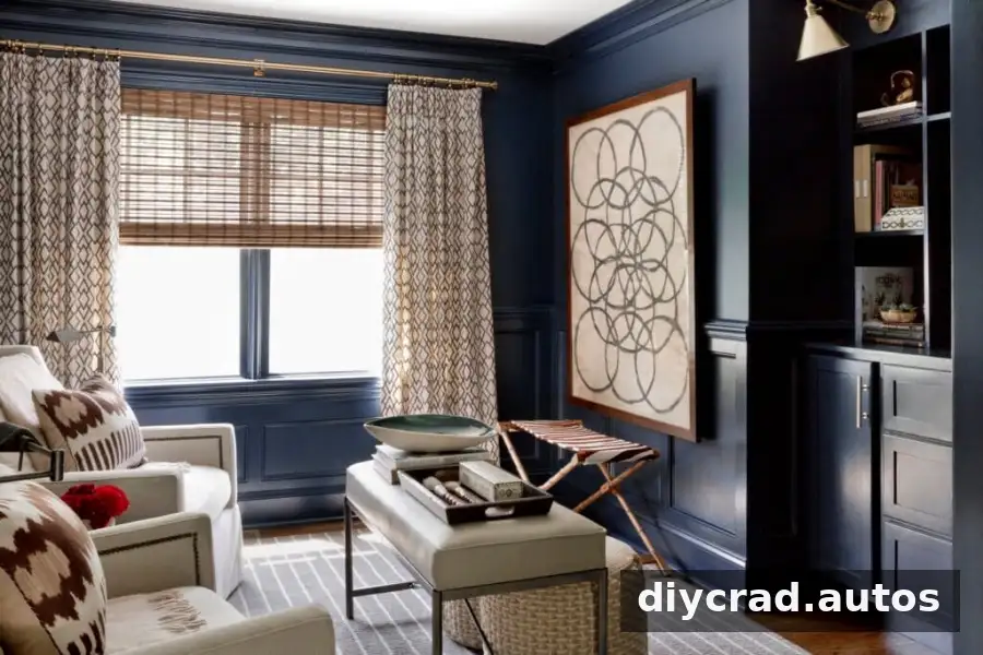
Source: Becca Interiors
Practical tip: For an exterior project, view the sample outdoors and compare it with the roof, masonry, and other permanent finishes.
4. Sherwin-Williams Naval
Naval is a deep blue that can bring a calm, grounded feel to a space. Its slight warm purple undertone adds complexity and can make the color adaptable to different design styles.
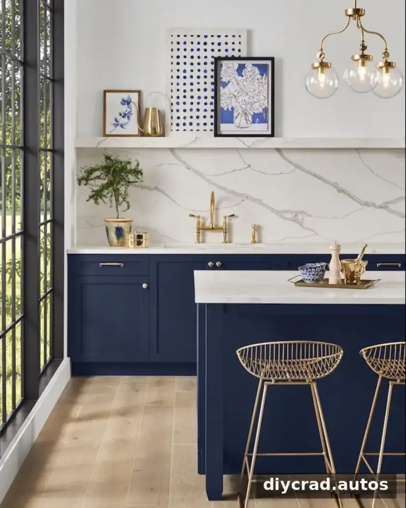
Sherwin Williams
Practical tip: If you are pairing Naval with white, compare the samples together; different whites can change how warm or cool the navy appears.
5. Benjamin Moore Newburyport Blue
Newburyport Blue is a vibrant, medium-toned blue that can make a noticeable statement. Subtle gray undertones soften the color and help it coordinate with a range of palettes and furnishings.
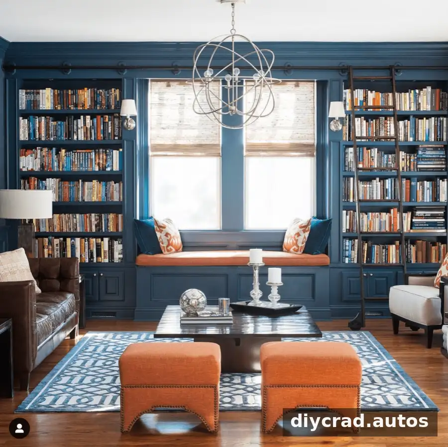
Source: Cory Connor Designs
Practical tip: Try it on a larger sample board before using it across a whole room, so you can judge its strength from different distances.
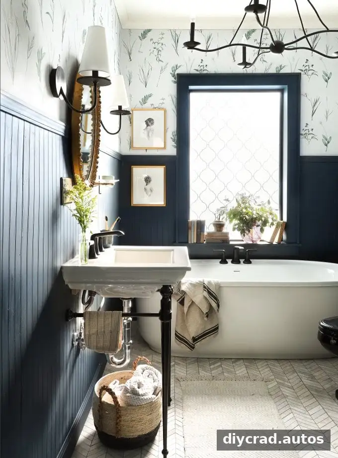
6. Behr Chimney
Behr Chimney is a deep charcoal gray with blue undertones, giving it a cool, slightly maritime character. Compared with more distinctly blue navies, it leans further toward gray and can serve as a subdued, versatile dark neutral.
Source: I Spy DIY
Practical tip: If you want a navy effect that is less saturated, compare Chimney directly with a more traditional blue sample on the same wall.
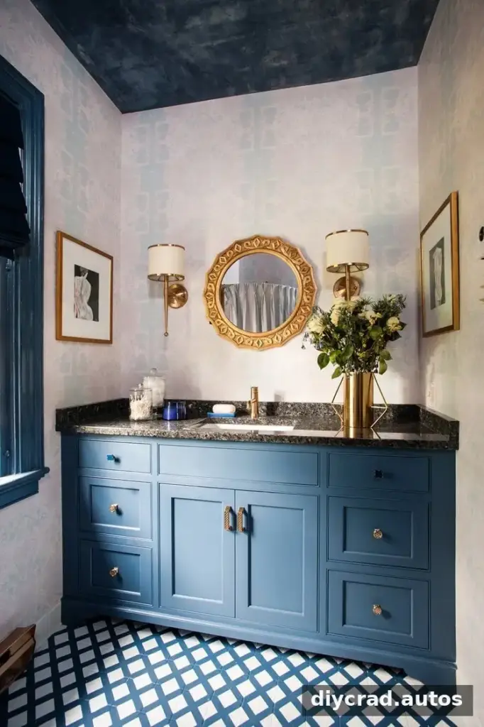
7. Benjamin Moore Van Deusen Blue
Van Deusen Blue is a rich, smoky blue with subtle gray undertones. Its softened appearance can suit a serene, refined room and gives it a muted quality compared with brighter blues.
Source: Melissa Mathe Interior Design
Practical tip: Look at the sample beside both warm and cool furnishings to see which palette brings out the undertones you prefer.
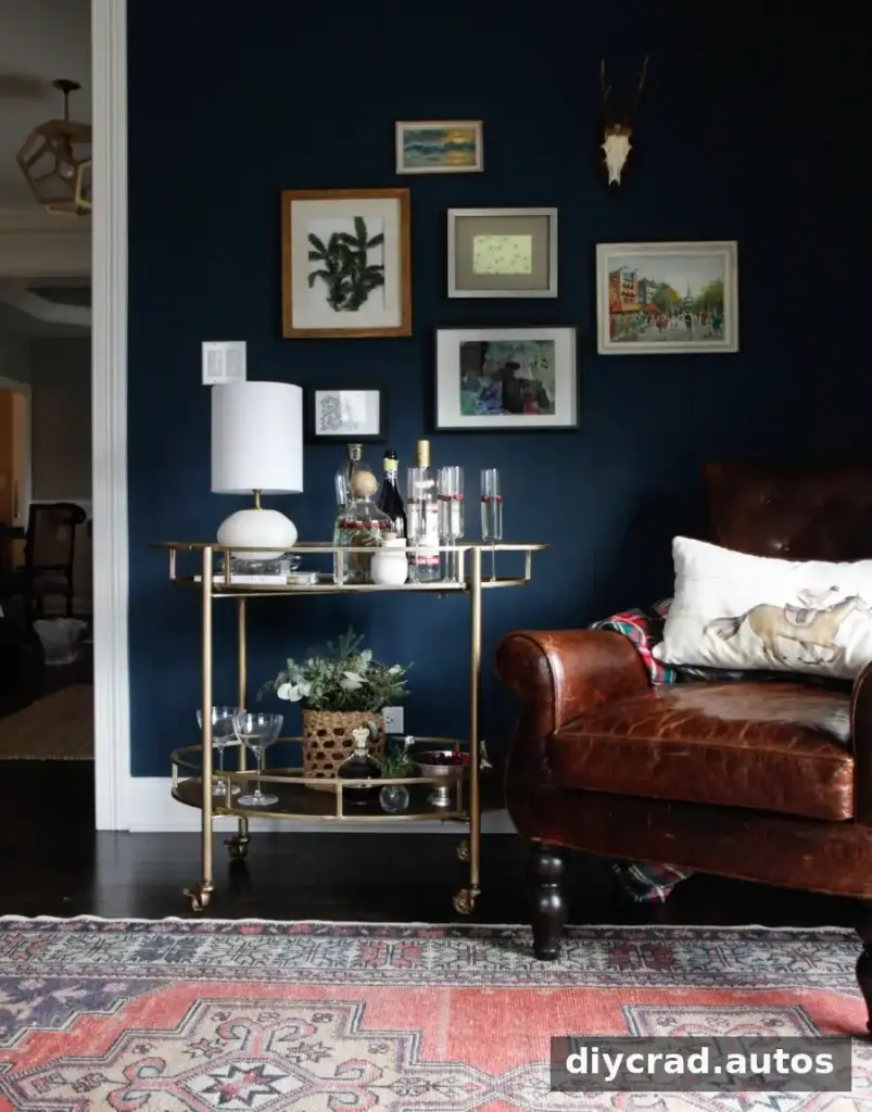
8. Farrow & Ball Hague Blue
Hague Blue is a deep navy with subtle green undertones and a strong sense of depth. The green influence adds warmth and complexity, making it worth considering for a range of interiors and lighting conditions.
Source: Park & Oak
Practical tip: Test Hague Blue in the exact location you plan to paint; its depth and green notes may appear different as daylight changes.
Choosing a Paint Sheen
Sheen affects how a painted surface reflects light and how easily it can be wiped clean. These are common starting points, though the best choice can depend on the surface and the look you want.
- Ceilings: Flat paint is a typical choice for a low-reflection finish.
- Walls: Eggshell offers a soft sheen and can generally be wiped clean.
- Cabinets: Satin is commonly recommended; semi-gloss is an option if you prefer a shinier finish.
- Trim and doors: Semi-gloss can create a traditional look, while satin offers a more modern appearance.
How to Find the Right Navy for Your Room
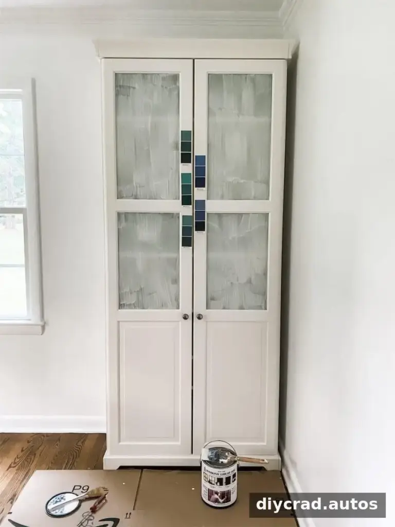
Do not rely on a small color card alone. A simple sampling process helps reveal undertones and shows how the shade responds to your room’s light.
- Choose a short list of favorites from paint swatches.
- Ask a paint store to prepare sample quantities of the colors you want to compare.
- Brush each sample onto a separate white foam poster board and place the boards on different walls. The white background can make undertones easier to notice.
- View the samples in daylight, under overhead lights, and with lamps. Check them at different times of day and again in the evening.
Move the boards around before making a decision. A color that looks balanced near a window may appear much darker on a wall with less natural light.
Does One Paint Color Work in Every Room?
No single paint color is guaranteed to look the same in every room. Natural light, bulbs, surrounding colors, and the direction and size of windows all affect how a shade is perceived. Even within one home, a navy that looks blue in one space may seem more gray or muted elsewhere.
For that reason, test the color in each room where you plan to use it. If you are painting multiple spaces, use separate samples rather than assuming the same shade will have an identical appearance throughout.
Frequently Asked Questions
What colors complement dark blue paint?
Orange sits opposite blue on the color wheel and can provide a complementary contrast. Yellow, pink, red, and white can also work with dark blue, depending on the specific shades and the atmosphere you want to create.
What color front door works with a navy blue house?
Yellow and blue are popular choices for front doors on navy exteriors. Before painting, compare samples with the house’s siding and other exterior finishes, and check them outdoors in changing light.
Final Thoughts on Navy Blue Paint Colors
Navy blue paint colors can add a classic, dramatic, or understated finish to walls, cabinets, furniture, and exterior details. Compare undertones, select a suitable sheen for the surface, and test samples in the room before committing. That extra step makes it easier to choose a navy that suits both your lighting and your overall color palette.