

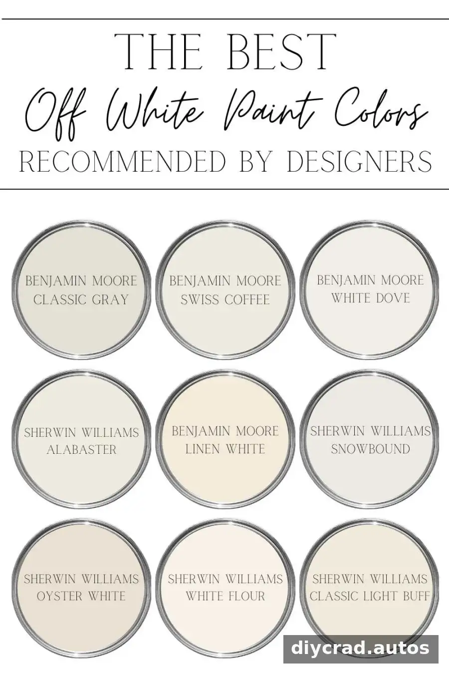
Choosing off-white paint colors can be surprisingly challenging: small differences in undertone and lighting may make a shade look creamy, gray, beige, or distinctly yellow. These designer-recommended options offer a range of warm, cool, and balanced whites, along with practical guidance for comparing them in your home.
White paint is not one-size-fits-all. A shade that looks soft and neutral on a sample card may appear cooler or warmer across a large wall. Use the colors below as a starting point, then test samples in the room and lighting where you plan to paint.
What to Consider When Choosing Off-White Paint Colors
Before settling on a color, consider the room’s light, existing finishes, and nearby paint colors. These factors can change how an undertone appears.
- Natural light: Note whether the room gets little or abundant daylight. The direction and amount of light can affect how warm or cool a white looks.
- Wood tones: Place samples beside flooring, furniture, and wood trim to see whether their undertones work together.
- Different lighting: Compare paint in daylight and under your usual artificial lighting, and check it at several times of day.
- Accurate samples: Use samples prepared by the paint’s manufacturer rather than a color match from another brand.
- Surrounding colors: Hold samples next to furnishings, counters, and other wall colors, especially in rooms with bold hues.
- Existing wall color: A primer over a strong existing color can help you judge the new shade more accurately.
- Exterior applications: View exterior samples outdoors in sunny and cloudy conditions and at different times, including morning and evening.
For a more reliable comparison, paint samples on separate boards or on different wall areas and observe them in place before committing to the full room.

1. Benjamin Moore Classic Gray
Classic Gray is a light, adaptable neutral that can read slightly gray or beige depending on the light. Its subtle warmth makes it an option for spaces where a bright, airy effect is desired without a stark white appearance.
Tip: Compare it with nearby flooring and trim, since those finishes may make its gray or beige quality more noticeable.
2. Benjamin Moore Swiss Coffee
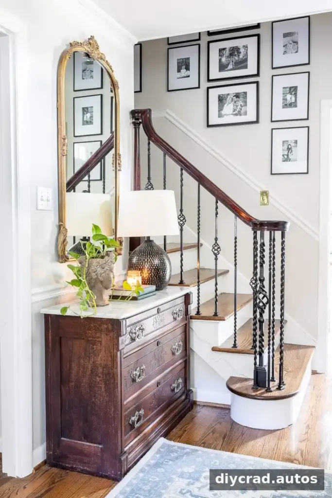
Swiss Coffee is a creamy off-white with a yellow undertone. It can create a soft, welcoming backdrop in bright living areas. Pairing it with black or deep gray, such as Benjamin Moore Wrought Iron, creates a stronger contrast and a more defined look.
Tip: Test it beside cool-colored furnishings, which may make its warmth stand out more.

3. Benjamin Moore White Dove
White Dove is a little lighter than Swiss Coffee while retaining a gentle warmth. It can work on walls, trim, and moldings, and may complement beige finishes in a room.
Tip: If you are coordinating it with countertops or tile, view the sample directly beside those surfaces rather than judging it on its own.

4. Sherwin Williams Alabaster
Alabaster sits between a warm off-white and a brighter white. Its soft warmth can help avoid the stark effect some crisp whites create, making it worth considering if you are unsure how creamy you want the finish to look.
Tip: Compare it with a brighter white sample in the same light to see which level of contrast suits the room.

5. Benjamin Moore Linen White
Linen White is a deeper off-white with a more noticeable yellow cast than several of the other options here. It may be useful in north-facing rooms, where colors can appear more muted.
Tip: Check it next to cool finishes and fabrics, since the contrast can emphasize its yellow undertone.

Source: Southern Living
6. Sherwin Williams Snowbound
Snowbound has a slightly gray undertone and reads cooler than Alabaster. It can be considered for walls, trim, cabinets, or exterior surfaces when a softer, less creamy white is preferred.
Tip: For exterior use, view a sample outdoors in more than one lighting condition before choosing.
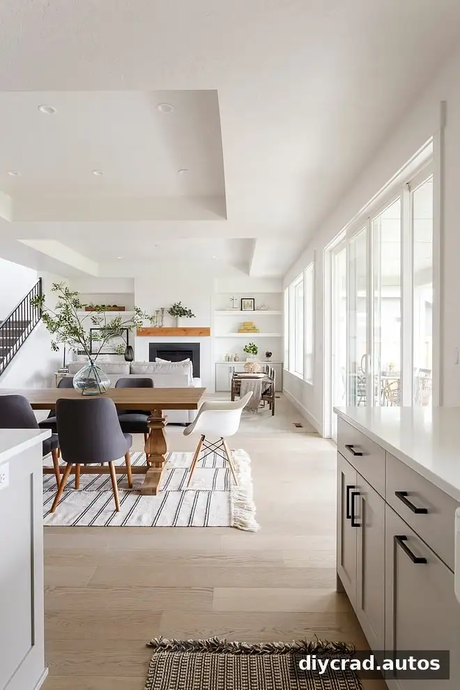
Source: Home Bunch
7. Sherwin Williams Oyster White
Oyster White sits closer to greige than to a clean white. Its appearance can shift with the room: it may look cooler in some settings and warmer in a darker space.
Tip: Compare it with both gray and beige elements in the room to see which side of its color character comes forward.
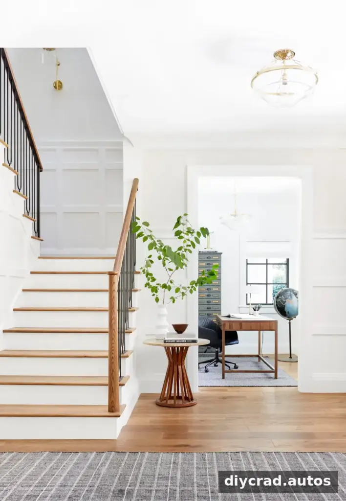
Source: Emily Henderson
8. Sherwin Williams White Flour
White Flour leans toward yellow, giving it a comfortable, warm impression. Nearby blue or gray colors may make that yellow quality more apparent, so it is important to consider the full palette.
Tip: Test it beside the colors and materials that will remain in the room, not only against white trim.

Source: Studio McGee
9. Sherwin Williams Classic Light Buff
Classic Light Buff is a creamy, casual off-white with a subtly sun-warmed appearance. It offers a softer alternative to a stark white while maintaining a clean, composed look.
Tip: Use a sample to check whether its warmth works with the room’s flooring and natural light.

Source: Southern Living
10. Romabio Feather
Romabio Feather is a light, airy off-white positioned between warm and cool. That balanced quality may make it worth testing when distinctly creamy or gray whites feel too strong.
Tip: Compare it with the other whites you are considering under the same lighting conditions.

Cool White Paint Colors to Consider
If you prefer a truer or cooler white rather than a warm off-white, these shades may be useful starting points:
- Benjamin Moore Chantilly Lace
- Benjamin Moore Simply White
- Sherwin Williams Pure White
- Benjamin Moore Cloud White
Even shades described as true whites can have undertones. Sample them in the room before deciding, especially if they will sit beside warmer walls, wood, or stone.
How to Choose the Right Off-White Paint
For the most dependable comparison, test a few leading options in the actual space and review them in natural and artificial light throughout the day. Consider how each shade relates to the room’s fixed finishes, and avoid making the final choice from a small color card alone.
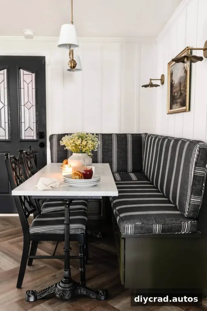
Paint sheen also affects the finished appearance. Flat paint is commonly used on ceilings, while eggshell is often selected for walls. Satin, semi-gloss, and gloss finishes are frequently used on trim, doors, and cabinets, though the right choice depends on the desired look and the surface.
Frequently Asked Questions
Is off-white paint in style?
Off-white remains a classic choice because it can feel softer than a stark white and works with many kinds of interiors. Design preferences change over time, but a well-chosen off-white can suit a room beyond any particular trend.
What paint sheen should I use?
Flat is often used on ceilings and eggshell on walls. Satin, semi-gloss, and gloss are common choices for trim, doors, and cabinets. These are general guidelines rather than strict rules, so consider the finish you want and the surface being painted.
Final Thoughts on Off-White Paint Colors
The best off-white paint colors are the ones that work with your room’s light, finishes, and overall palette. Compare real samples in place, pay attention to undertones, and review them at different times of day before selecting a final shade.