


A thoughtful whole house paint color palette helps rooms feel connected without making every space look the same. This collection balances warm and crisp whites with gray-green, blue, mauve, and deep charcoal shades. Use the colors as a starting point, then consider how your lighting, finishes, and furnishings affect each room.

Choosing a single paint color can take time; coordinating several rooms brings additional considerations. Open sightlines, room size, natural light, flooring, and trim can all influence how a shade appears. One practical strategy is to begin with a small group of versatile neutrals, then use stronger colors in selected rooms or on features such as cabinets and doors.
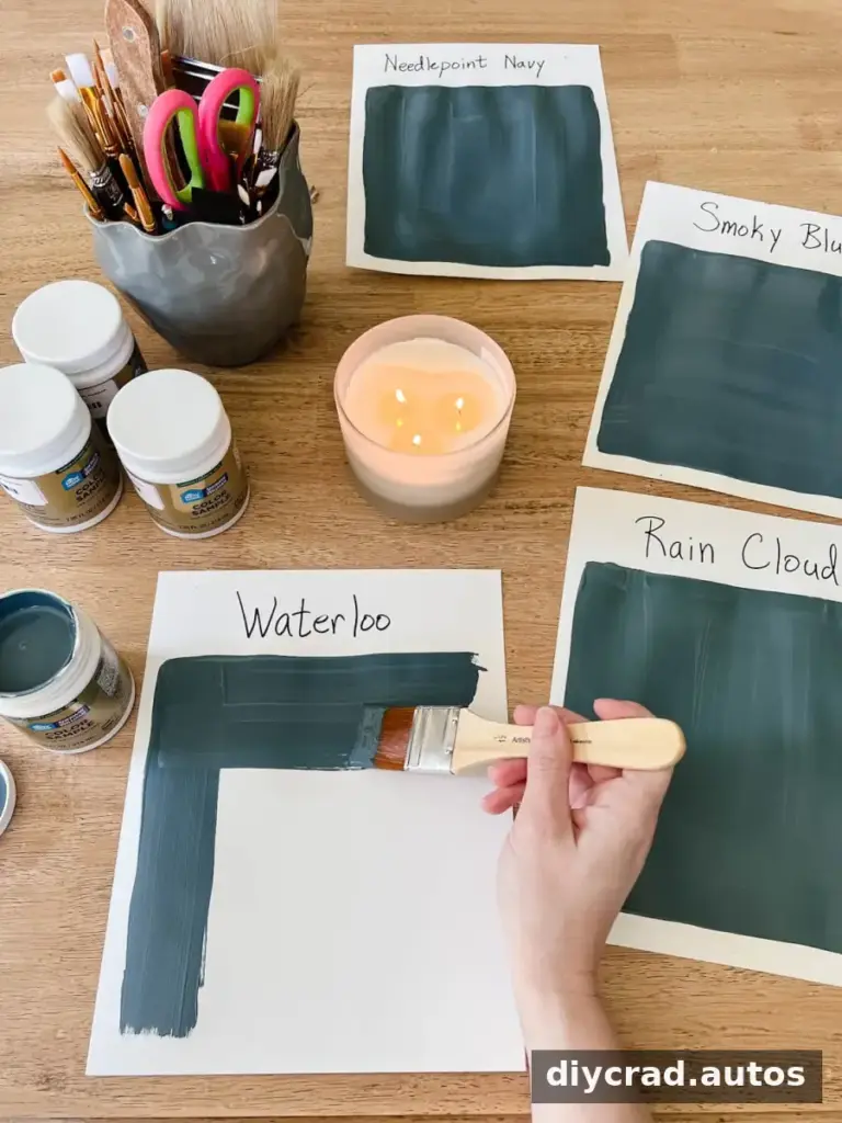
Paint colors can look different from one room to another, even when the same shade is used. Before committing, test your preferred options where they will be applied. Digital images and small color strips are useful for narrowing the field, but they cannot reproduce the exact effect of your home’s light and surrounding finishes.
How to Choose a Whole House Paint Color Palette
- Use online paint images for inspiration, not as an exact color reference. Screen settings and photography can change how a shade appears.
- Compare physical sample strips to identify colors that suit your general direction.
- Purchase sample pots for your shortlist. A larger painted area makes undertones and overall intensity easier to judge.
- Apply samples to white foam boards and move them around the room. Check them in daylight, in shadow, and under your usual evening lights.
- Consider the level of contrast you want. A very light or dark shade may create a sharper contrast than a mid-tone color.
For a more useful comparison, place sample boards near fixed features such as flooring, trim, countertops, and tile. Those materials are harder to change and can reveal whether a paint color’s undertones work with the room. If several rooms connect visually, view the samples from the adjoining spaces as well.
Our Calming Whole House Paint Color Palette
1. Benjamin Moore Swiss Coffee
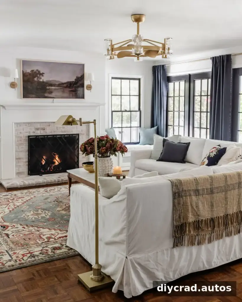
Swiss Coffee is a gently creamy white that can make a room feel bright without the starkness of a cooler white. It can also be used on trim. For a simpler white trim option in this palette, Sherwin Williams Simply White is another choice. Compare both with wall colors and nearby surfaces before selecting a finish.
2. Benjamin Moore Wrought Iron
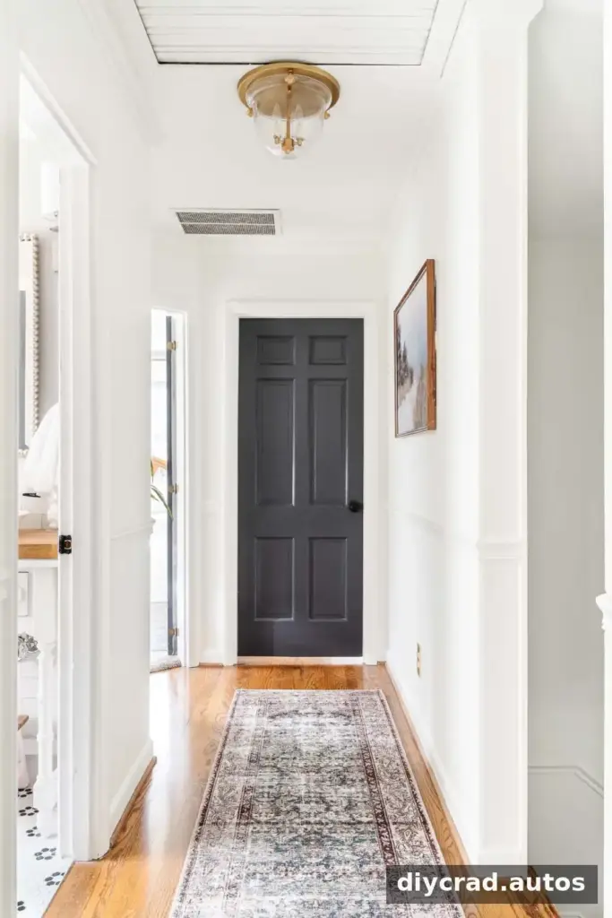
Wrought Iron is a near-black charcoal that gives doors a defined, polished appearance. A dark finish may also make small marks less noticeable than they would be on a pale surface, although frequent-use areas still benefit from a cleanable finish suited to the material.
3. Benjamin Moore Chantilly Lace
Chantilly Lace is a crisp white used on the walls of a home office, foyer, stairway, hallway, and primary bathroom. A bright white can read differently as daylight changes, so compare it in each space where you plan to use it. This is especially helpful when rooms have different window directions or artificial lighting.
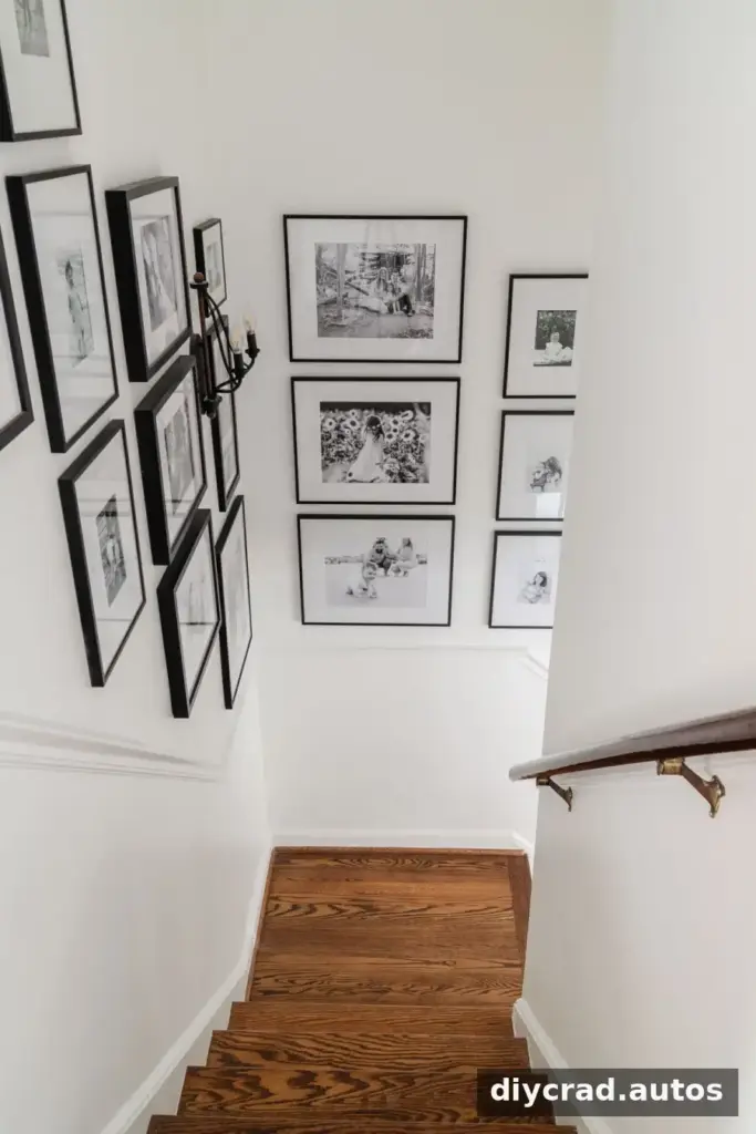
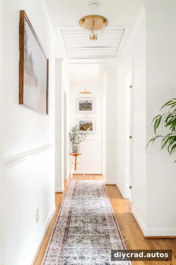
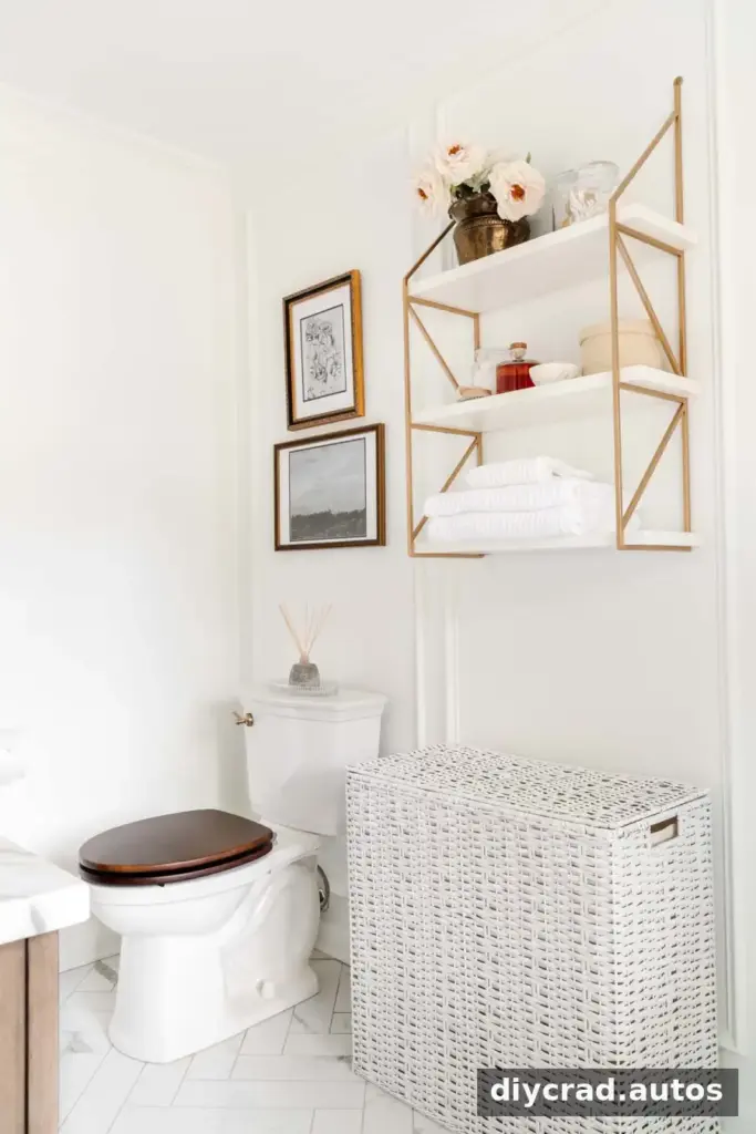
4. Sherwin Williams Willowleaf
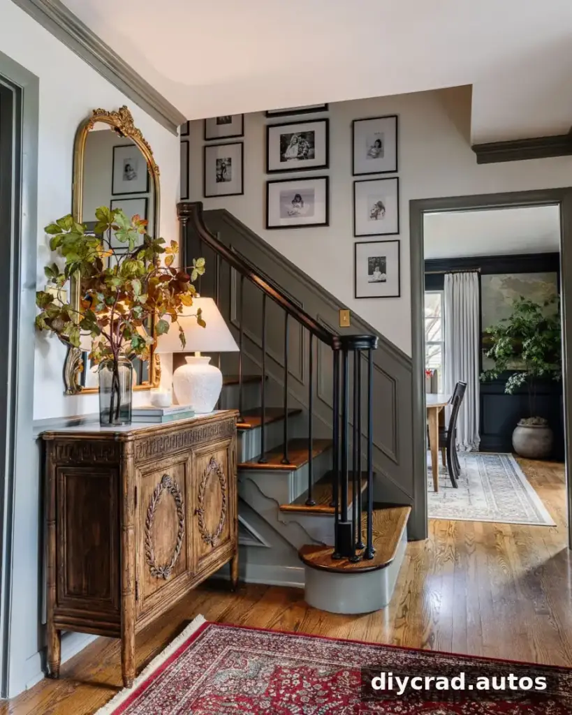
Willowleaf sits between green and gray, offering a subtle way to bring color into a home. In a foyer, contrasting trim can add definition while allowing the wall color to remain the main feature. Test the shade beside the trim rather than judging it on its own.
5. Sherwin Williams Slate Tile
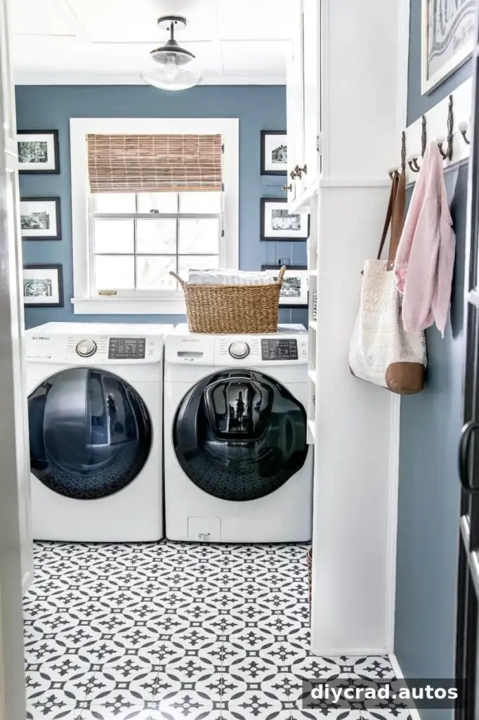
Slate Tile is a deep blue softened by gray, giving it a muted, dusty quality. It was used on bathroom cabinets and is also noted as a suitable favorite for a laundry room. Blue-gray colors can shift noticeably with lighting, so check a sample near the room’s fixtures and surfaces.
6. Romabio Blue Ridge Parkway
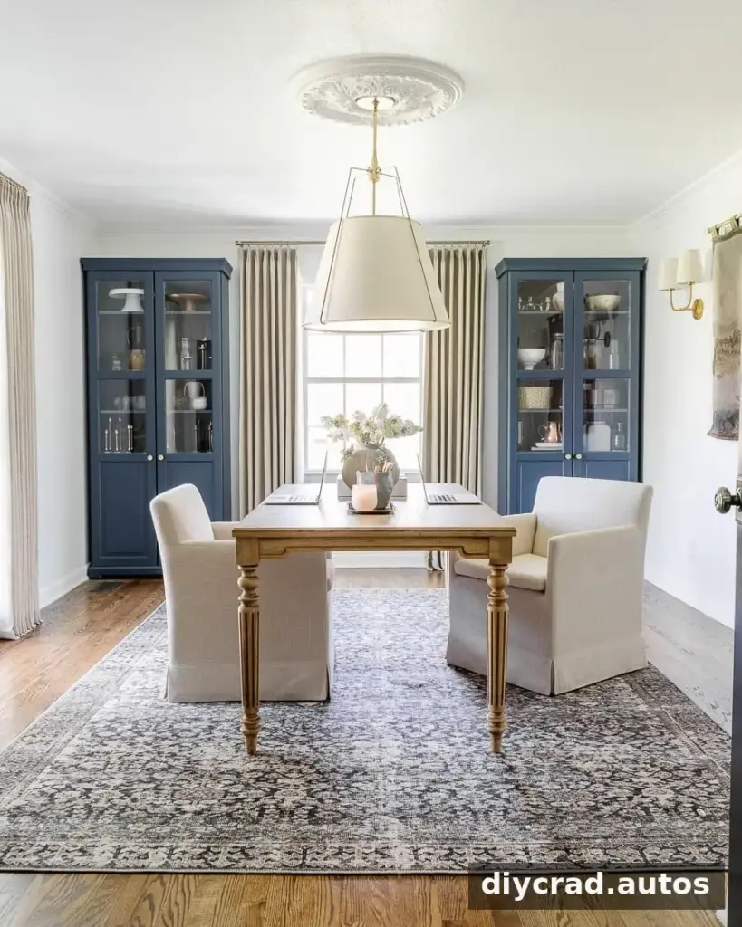
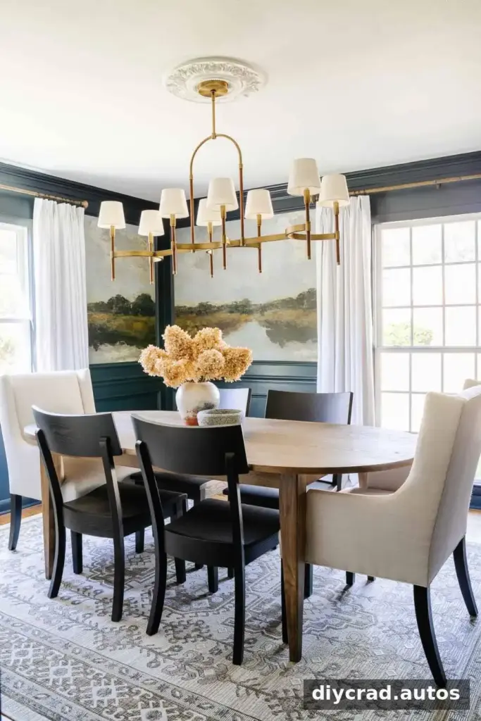
Blue Ridge Parkway is a rich, classic navy that brings a clear dose of color while pairing with many neutrals. It was used in a dining room, where a deep blue can help create a welcoming, defined setting. Balance it with lighter nearby finishes if you want the room to feel less visually enclosed.
7. Sherwin Williams Billiard Green
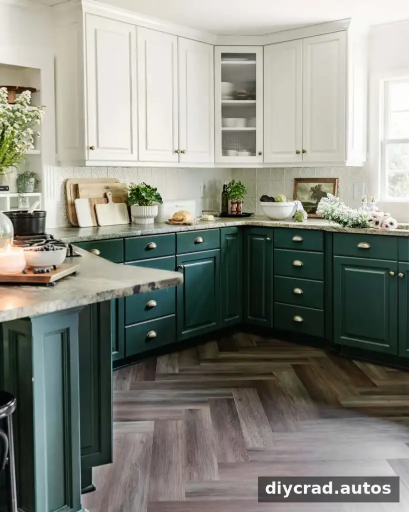
Sherwin Williams Billiard Green was used on lower kitchen cabinets, with Benjamin Moore Simply White on the upper cabinets. The rich green recalls the color of billiard-table felt. Pairing a deeper lower-cabinet shade with white above creates contrast while keeping the overall scheme balanced. Test the green beside the countertop and backsplash before painting.
8. Sherwin Williams Cascades
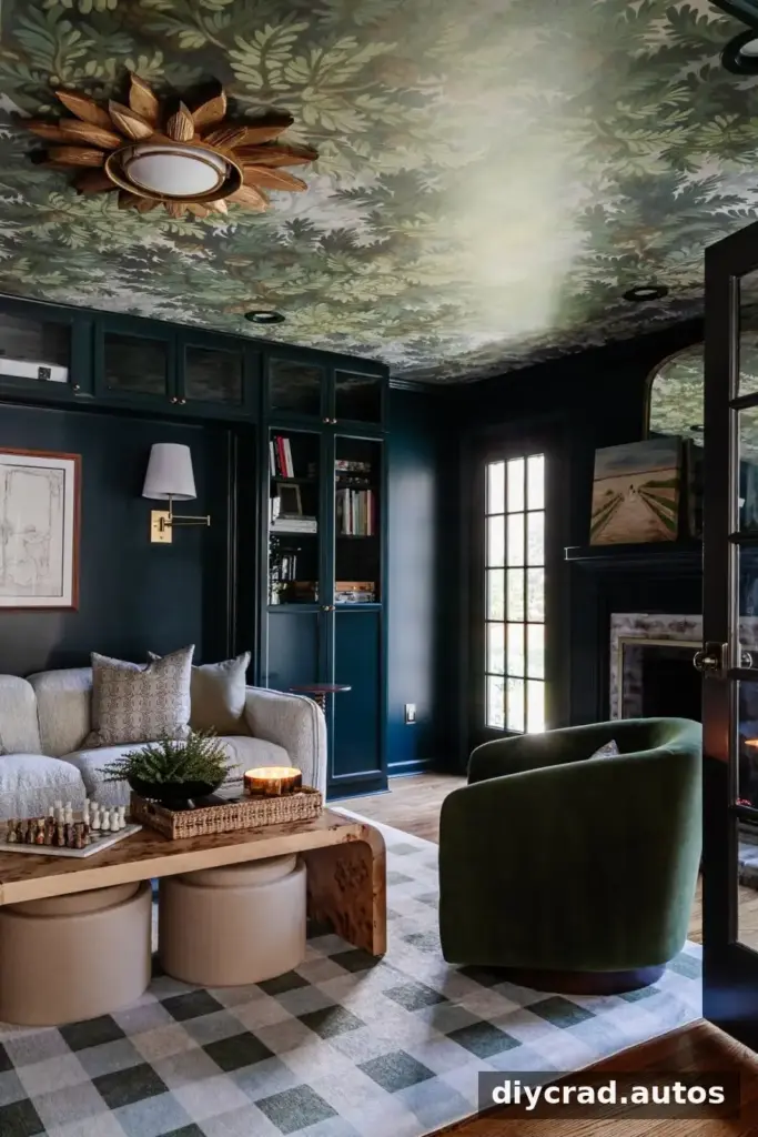
Cascades was selected for a media room. Depending on the light, it can appear as hunter green, deep teal, or navy blue. Since this color can shift between several deep tones, test it during both daylight and evening viewing conditions before deciding how much of the room to paint.
9. Farrow and Ball Brinjal
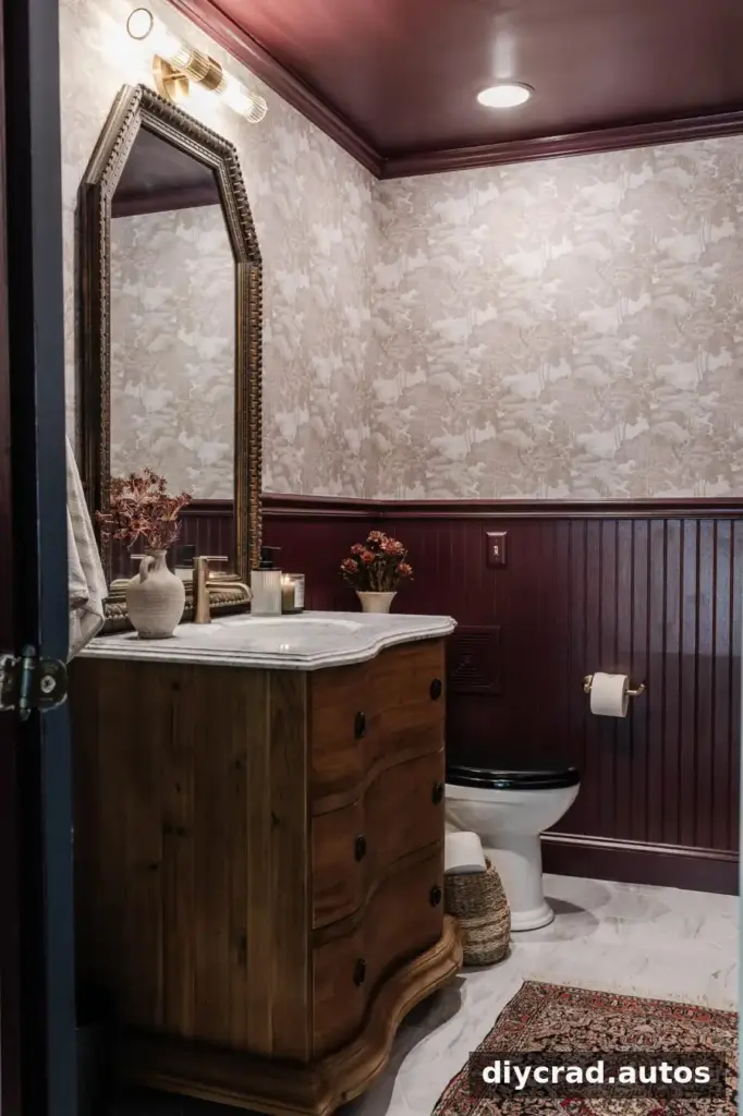
Brinjal is a bold color between burgundy and eggplant. Used in a powder room, it can add a warm, cozy mood to a small space. Deep colors may look different across a full wall than on a tiny strip, so use a generous sample area before making a final choice.
10. Sherwin Williams Smoky Blue
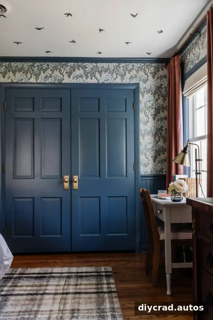
Smoky Blue is a strong but dusty blue with a historical character. It was used in a bedroom and provides a more muted alternative to a brighter blue. Compare it with bedding, curtains, and other nearby fabrics to check that the room’s colors work together.
11. Behr Postmodern Mauve
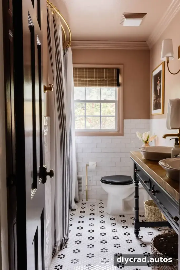
Postmodern Mauve is a medium blush pink with a neutral-leaning quality. It was used in a bathroom to introduce warmth and color without making the space feel overly bright. A sample can help you see whether its pink undertone suits the room’s lighting and tile.
12. Kilz Rebel
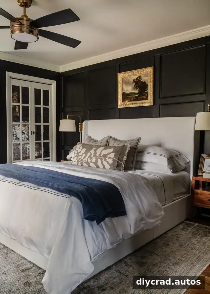
Kilz Rebel is a very deep, true black used for a bedroom makeover. It can create a dramatic, sophisticated effect, particularly when balanced with lighter textiles or furnishings. Because black can feel especially bold over a large area, check a sample on more than one wall if the room receives varied light.
13. Romabio Barefoot Dance
Romabio Barefoot Dance was used on a ceiling alongside Magnolia True White walls. Barefoot Dance is a peachy blush shade that adds color overhead. Magnolia True White is described as a bright, clear white, though its coverage was not considered satisfactory in this project. Follow the paint label’s preparation and application guidance, and check coverage on a test area.
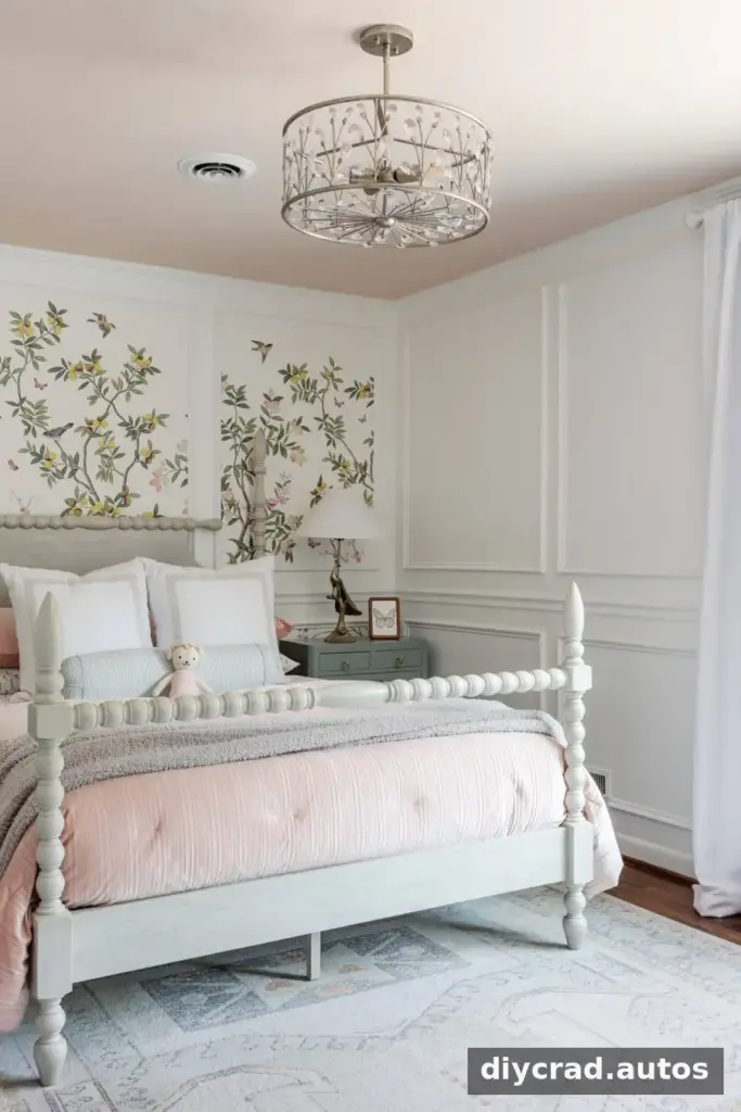
14. Benjamin Moore White Dove
White Dove is a soft white with a slight cream undertone, between bright white and ivory. In a guest bedroom, it was used on the walls with Benjamin Moore Winter Gates on the trim and doors. Winter Gates is a warm gray with a yellow undertone that pairs well with cream and ivory. Sample the two together to confirm the contrast feels right in your room.
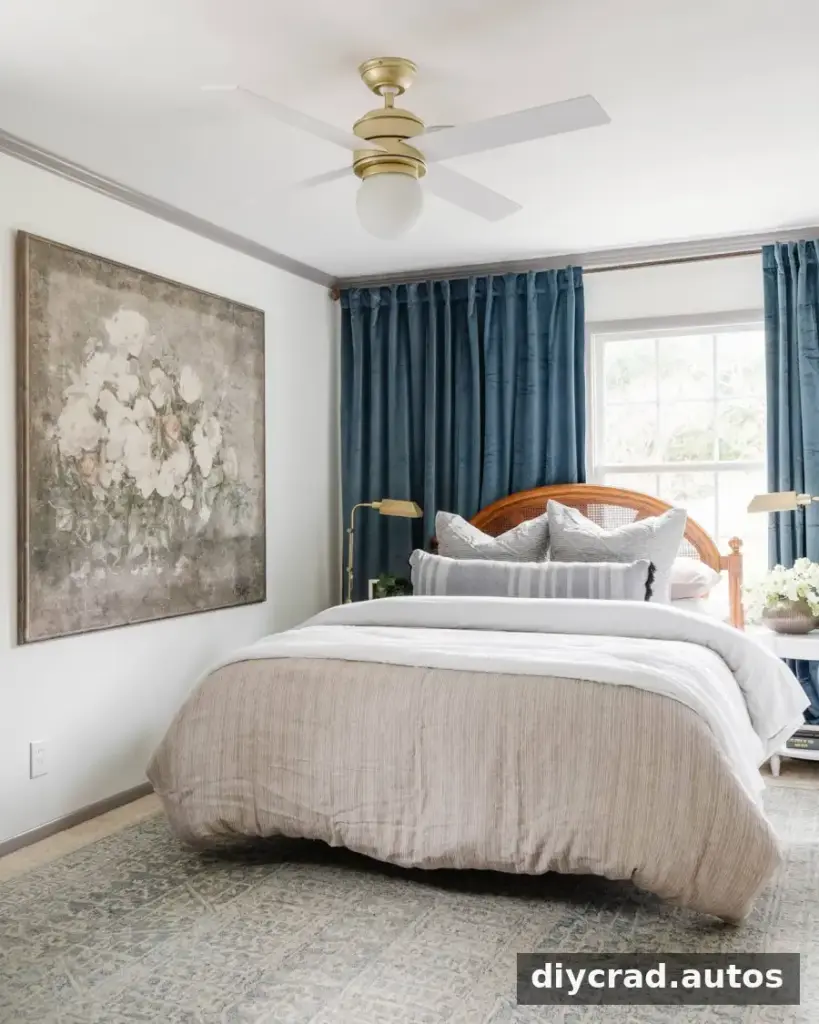
15. Benjamin Moore Palladian Blue
Palladian Blue is a pale blue with an aqua quality, reminiscent of porch-ceiling colors often seen in Charleston. It can be considered for porch ceilings or interior walls when a light but noticeable blue is desired. Check it against the exterior or interior finishes around it to make sure the color feels cohesive.
Frequently Asked Questions
Is it OK to paint every room the same color?
Yes, using one color throughout can work well, particularly in an open floor plan with few clear visual breaks. In a home with more distinct rooms, repeating a few shades or undertones can maintain a sense of connection while allowing individual spaces to have their own character.
Should the ceiling match the trim?
That depends on the look you want. A colored ceiling or contrasting trim can act as a feature. If both surfaces are white, choosing the same shade can create a more coordinated appearance. Always consider the wall color and the amount of contrast between surfaces.
Which paint sheen should I use?
A common starting point is flat for ceilings, eggshell for walls, satin for cabinets, and semi-gloss for trim and doors. The best choice depends on the surface, how much cleaning it needs, and the manufacturer’s recommendations. Gloss is often used when a particularly shiny, modern look is wanted on furniture. Check product guidance before purchasing, since sheen and durability can vary by paint line.
Conclusion
This whole house paint color palette brings together adaptable whites and warm neutrals with expressive blues, greens, mauve, and deep charcoal. Use the named shades as inspiration, but test samples in your own rooms alongside fixed finishes and under different lighting. Taking time to compare colors before painting can help create a home that feels connected while giving each space its own atmosphere.

