


Learning how to choose paint colors for your home can save time, money, and the frustration of repainting a room. A shade that looks perfect on a store sample or screen may appear very different on your walls because of room lighting, surrounding colors, and undertones. Use these practical steps to narrow your options and test them before committing.

A thoughtful process does not need to be complicated. Start with the items already in your room, decide how you want the space to feel, and evaluate real paint samples in the light you actually live with. Spending a day or two testing colors can help prevent a decision you might regret for years.
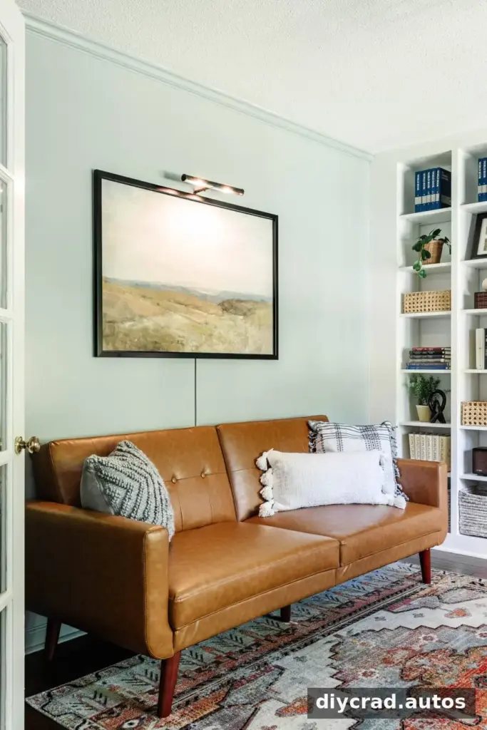
Three Common Paint Color Mistakes
1. Choosing paint before other room elements
It is often easier to coordinate paint with a rug, fabric, tile, wallpaper, or artwork than to find those items after choosing a wall color. Begin with an element you plan to keep, then use it to guide your palette. For example, an existing green-toned countertop can be a useful reference when considering a complementary cabinet color.
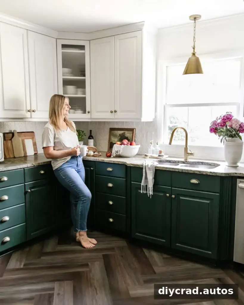
2. Selecting a color from a store swatch alone
Paint displays are useful for narrowing choices, but a small swatch viewed briefly under store lighting cannot show exactly how a color will look at home. Lighting and undertones affect how paint is perceived. Treat the swatch as a starting point, not a final decision, and test a sample in the room before buying enough paint for the whole project.

3. Painting samples directly over an existing wall color
A sample applied over a strongly colored wall can be influenced by the color beneath it, making it harder to judge accurately. Instead, paint samples on white poster board or card stock. This also lets you move each sample around the room and compare it in different locations.
How to Choose Paint Colors for Your Home in Five Steps
Step 1: Start with an inspiration piece
Choose one item that will help set the room’s palette. It might be something you already own or a piece you plan to use in the finished space. A paint store may be able to use a sample to suggest coordinating shades.
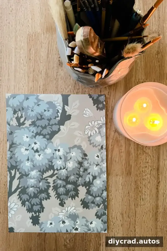
Useful inspiration pieces
- Wallpaper
- A piece of art or a tapestry
- A rug
- Fabric, such as a quilt, curtain, or pillow
For a shared bedroom, a large beach-themed artwork can provide a starting point for a soft, sky-inspired wall color. In another room, a rug may offer several possible shades to draw from. Bring a portable sample of your chosen item to the paint store when color matching is available.

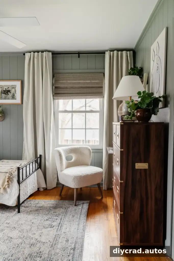
Step 2: Decide how you want the room to feel
Color can influence the mood a room suggests. Before looking at specific shades, think about the atmosphere you want: calm, fresh, dramatic, or simple. Personal preference matters most, but identifying a feeling can help you narrow a broad range of options.
For instance, a deep, dark color may create a dramatic bedroom, while green can give a kitchen a fresh impression. A clean white may suit a simple, minimalist bathroom. Consider the room’s purpose, the colors of furnishings, and how much contrast you enjoy before settling on a color family.

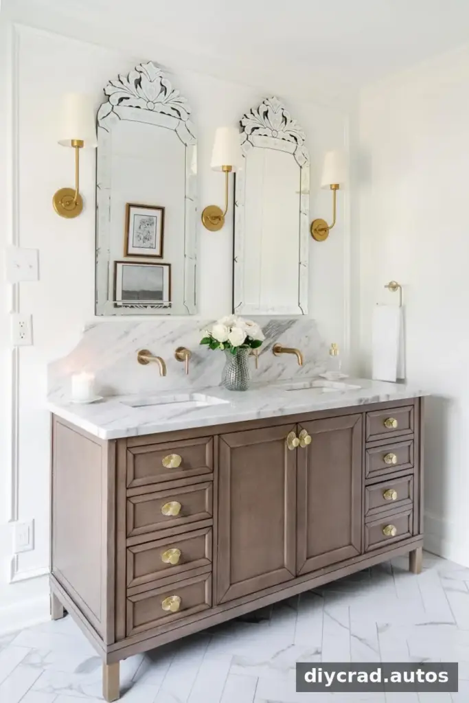
Step 3: Look for ideas, but verify colors in person
Interior photos, search results, social media, and paint visualization apps can help you discover shades worth sampling. Save a few ideas or identify a color family rather than trying to reproduce an online image exactly. Screens vary in brightness and color balance, and photos may be edited or taken under different lighting conditions.

Some apps let you preview paint colors on a room photo or compare a color with an inspiration image. These tools are useful for visualizing possibilities, but they cannot perfectly represent the paint, surface, and light in your home. Use them to create a shortlist, then test physical samples.
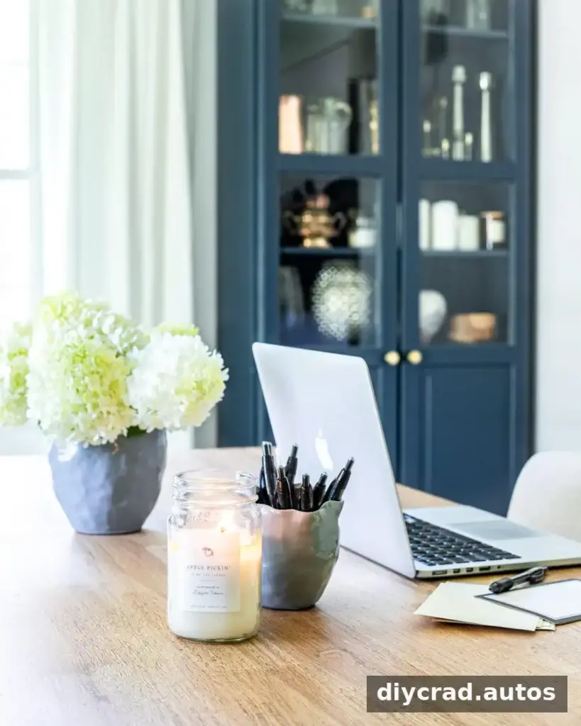
What to look for in a paint color app
- Room-photo previews that help you compare broad color families
- Tools for saving and organizing possible shades
- Color matching or palette features, if available
- A clear reminder that digital previews are estimates, not exact matches
Step 4: Identify the undertones
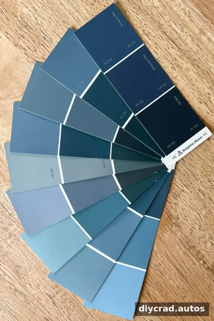
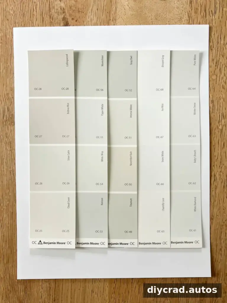
The main color of a paint may be easy to recognize, while its undertone is less obvious. A gray can lean blue, green, or purple; a white can appear warm or cool. Undertones become especially noticeable beside flooring, furniture, trim, and other colors in the room.
Warm colors generally have red, orange, or yellow undertones. Cool colors tend toward green, blue, or purple undertones. To compare undertones, place a paint strip against plain white paper and view it in soft natural light. Looking at the darkest shade on a strip can also make its underlying color easier to spot.
Step 5: Test large samples in the room
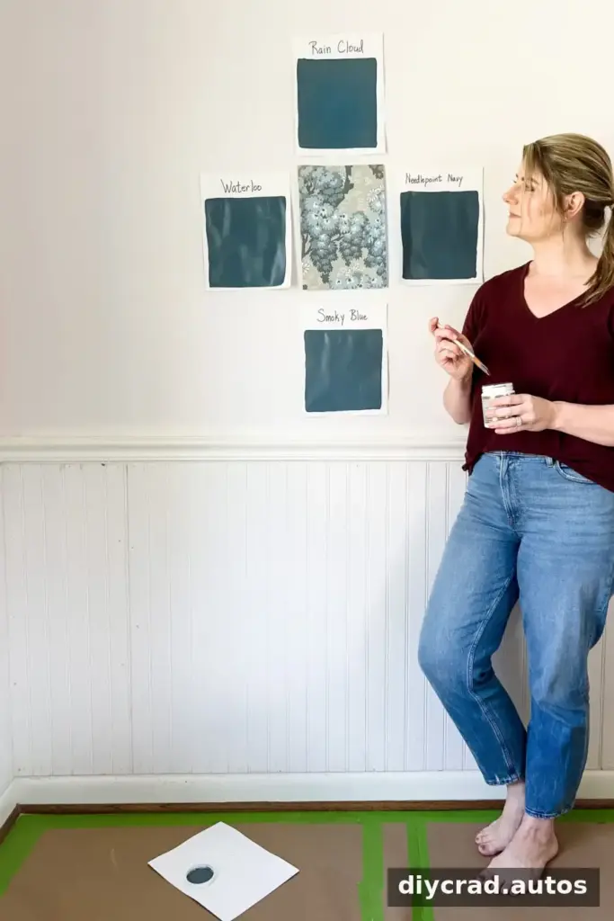
Once you have narrowed your options, buy sample pots and paint each color onto a separate piece of white poster board or card stock. Use a clean brush for each shade. Place the boards on different walls rather than relying on a single spot, since light and nearby surfaces can vary around the room.
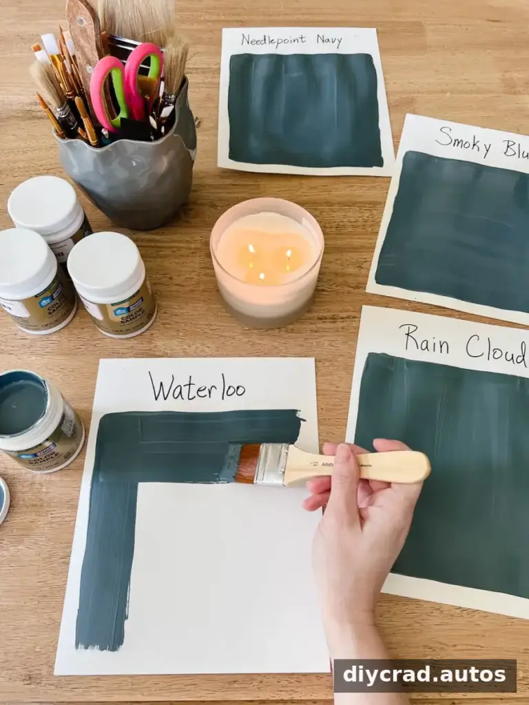
Leave the samples in place for at least 24 hours, and ideally a day or two. Check them in the morning, at midday, and in the evening, as well as on sunny and overcast days when possible. Compare the samples with your flooring, furniture, and trim. This gives you a more useful impression than viewing a small swatch in isolation.
How Lighting Affects Paint Colors
Light bulbs and daylight can shift how a paint color appears. When testing samples, use the bulbs you expect to keep in the room. This helps you evaluate the color under realistic conditions instead of making a choice that only works in temporary lighting.
Light bulb color temperature
- Daylight bulbs above 4500 Kelvin can make colors appear bluer.
- Warm white bulbs between 2700 and 3000 Kelvin can make colors appear yellower.
- Bright white bulbs between 3000 and 4500 Kelvin are generally more neutral.
These effects can vary with the bulb and the room, so use them as a guide and judge the sample in place. Keeping samples up for at least 24 hours makes it easier to see how they change through the day.
Room direction and natural light
- North-facing rooms often receive less direct light, which can appear cool or blue-gray. A warm undertone may help balance that effect.
- South-facing rooms usually receive brighter, warmer light for more of the day. Many colors can work well, while cool shades may help balance a warmer appearance.
- East- and west-facing rooms can change noticeably as the sun rises or sets. Test samples at different times before deciding.
These are general tendencies, not guarantees. Window size, trees, nearby buildings, and interior finishes can all affect the light in a particular room.
Creating a Coordinated Interior Color Scheme
A whole-home palette does not require every room to be the same color. A few simple guidelines can help the rooms feel connected without making the scheme feel repetitive.
- Keep the palette manageable. Try limiting a room to about three main colors. If one shade is bold, use calmer supporting colors to give the eye a break.
- Choose the boldest color first. Neutrals are often easier to adjust around a stronger choice. An accent wall can be one way to use a bold shade without covering every surface.
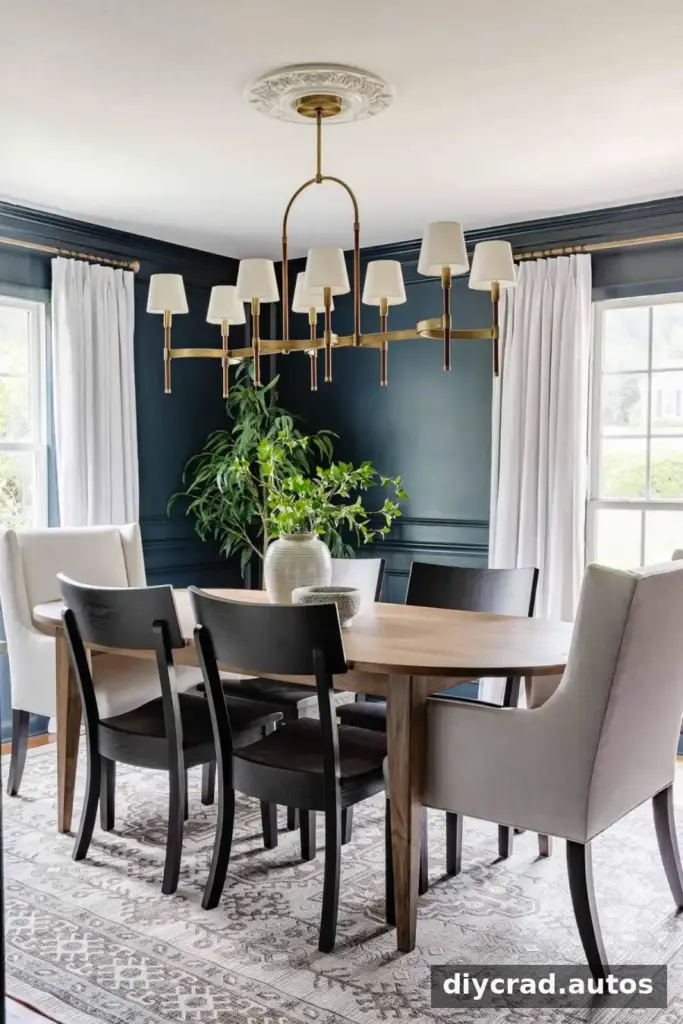
- Try green or blue if you want color without an overly intense effect. Both occur widely in nature and may feel familiar in many interiors. Navy can also work much like a neutral alongside a range of colors.
- Compare colors from the same paint strip or collection. Related shades often share undertones, which can make it easier to find colors that work together. Still, test them in the actual room before painting.
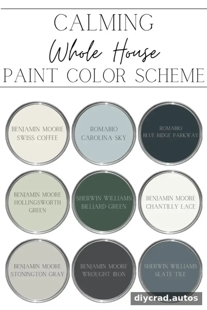
Paint is changeable, but repainting takes effort and adds cost. A careful sample test is a simple way to reduce both. If the color does not feel right after seeing it in several lighting conditions, adjust your shortlist before starting the full project.
How to Choose Paint Colors for Your Home: Quick Recap
- Choose an inspiration item such as art, a rug, fabric, or wallpaper.
- Decide how you want the room to feel.
- Use photos and apps to gather ideas, not to make the final decision.
- Compare undertones against white paper in natural light.
- Test large samples around the room and observe them for a day or two.
Taking time to learn how to choose paint colors for your home helps you account for the room’s furnishings, undertones, and changing light before you commit. A small investment in samples can make the final color choice more confident and help you avoid unnecessary repainting.
Frequently Asked Questions
What colors can make a room look bigger and brighter?
Light neutrals, off-whites, and pastels can make a room feel more open and bright, especially when they work well with the available light. A reflective finish may also bounce more light, but consider the wall condition and the look you want before selecting a sheen.
What paint colors can make a home look more polished?
High-contrast combinations, such as bright white walls with charcoal details or dark navy walls with white trim, can create a defined, tailored look. Consistent undertones and carefully chosen trim colors help the palette feel intentional.
What is a restful color for a bedroom?
Many people find blue calming, while soft greens and muted neutrals can also create a relaxed atmosphere. The best choice depends on your taste and the room’s lighting, so test a sample before painting.

