

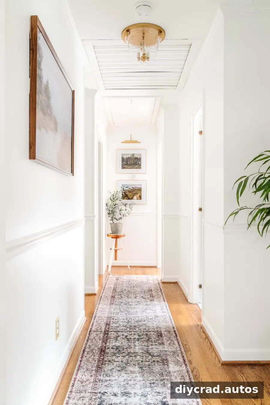
Contrast trim paint colors can give a room a noticeable refresh without requiring you to repaint every wall. Pairing a light wall color with darker or more saturated trim adds definition to doors, mouldings, and other architectural details. It can also introduce color in a measured way if you prefer neutral walls.
Rather than painting a whole room in one color, consider using contrasting paint on the baseboards, door casings, interior doors, crown moulding, or wainscoting. The effect can range from subtle to dramatic depending on the colors and how much trim is painted.
What Is Contrast Trim?
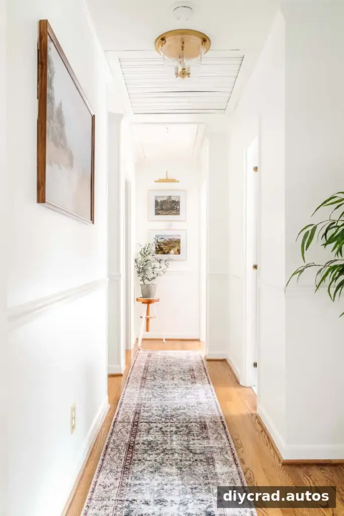
Contrast trim combines walls in one color with trim in a noticeably different shade. Light walls—such as white, light gray, or beige—are often paired with deeper trim, though a soft contrast can work just as well. In general, darker or more saturated trim creates a bolder look, while colors closer in brightness feel more understated.
Why Choose Contrasting Trim?
Painting trim is one way to add color without committing to a full room makeover. It can draw attention to mouldings, door frames, and other details, particularly in older homes with distinctive architectural features. In a small space, a carefully chosen trim color can create visual interest without adding physical clutter.
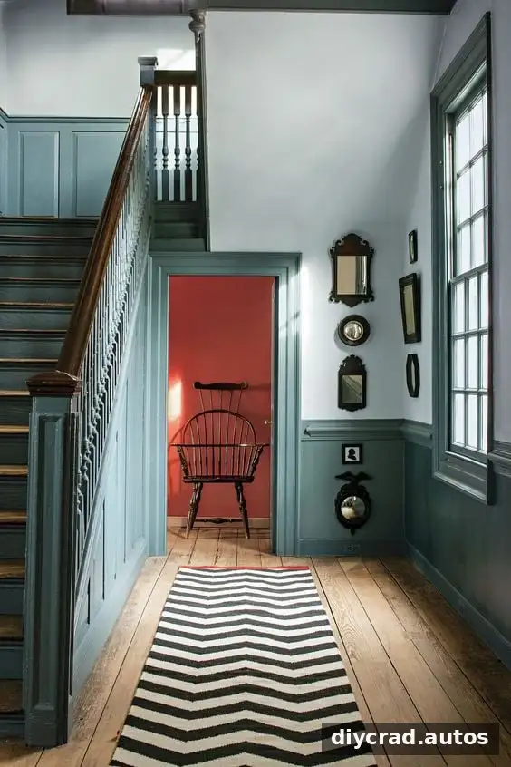
Hallways, stairways, and foyers are useful places to consider this approach because their doors and mouldings can form a natural visual outline. Before choosing a strong shade, look at how the trim connects to nearby rooms so the color feels intentional as you move through the home.
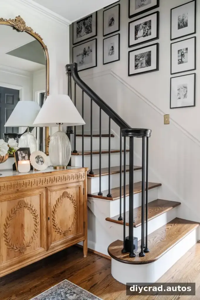
A blue or green trim color can bring a calm, colorful accent to mouldings and wainscoting. For a more cohesive result, consider repeating a related shade in a nearby accessory or piece of artwork.
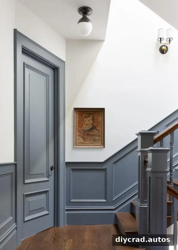
Source | Sunset
Contrast Trim Paint Colors to Consider
The shades below cover a range of color families, from warm reds and yellows to cooler blues and greens, plus versatile neutrals. Use the names as a starting point, then check current paint samples and availability with the manufacturer or a local paint retailer.
Color can look different under daylight, warm bulbs, and in rooms with limited natural light. Test sample patches next to both the wall color and the floor, and view them at different times of day before making a final decision.
Red Trim Paint Colors
- Farrow & Ball Preference Red
- Benjamin Moore Classic Burgundy
- Sherwin Williams Rustic Red
Source | Becca Interiors | Rikki Snyder
Orange Trim Paint Colors
- Sherwin Williams Cavern Clay
- Benjamin Moore Tarra Mauve
- Farrow & Ball Charlotte’s Locks
Source | Avery Cox Design
Yellow Trim Paint Colors
- Farrow & Ball India Yellow
- Benjamin Moore Man on the Moon
- Sherwin Williams Restrained Gold
Source | Wit and Delight
Green Trim Paint Colors
- Farrow & Ball Green Smoke
- Benjamin Moore Soft Fern
- Sherwin Williams Evergreen Fog
Source | One Kindesign
Blue Trim Paint Colors
- Farrow & Ball Down Pipe
- Benjamin Moore Water’s Edge
- Sherwin Williams Stardew
Source | Vanderhorn Architects | Amy Hirsch Design
Purple Trim Paint Colors
- Farrow & Ball Brinjal
- Sherwin Williams Expressive Plum
- PPG Purple Dusk
Source | Notes of Colour
Pink Trim Paint Colors
- Farrow & Ball Sulking Room Pink
- Benjamin Moore Bashful
- Sherwin Williams Cabbage Rose
Source | Stef Turner
Gray Trim Paint Colors
- Farrow & Ball Lamp Room Gray
- Benjamin Moore Coventry Gray
- Sherwin Williams Peppercorn
Source | Bell-Guilmet
Beige Trim Paint Colors
- Farrow & Ball Stony Ground
- Benjamin Moore Revere Pewter
- Sherwin Williams Accessible Beige
Source | Carpendaughter
Black Trim Paint Colors
- Farrow & Ball Pitch Black
- Benjamin Moore Wrought Iron
- Sherwin Williams Tricorn Black
Source | Lovisa Hager
How to Choose the Right Trim Color
A paint sample strip can help you find related shades with compatible undertones. Try a light color from the strip for the walls and a darker color from that same strip for the trim. This is a helpful starting point because the colors are designed to sit within the same palette, though lighting and surrounding finishes can still affect how they look together.
Source | Benjamin Moore
For a more reliable comparison, paint sample boards rather than judging small chips alone. Place the boards beside the trim and wall, and move them around the room to check them in different light. Also consider the finish: trim is often painted in a finish that is easier to clean than a flat wall finish, but the best option depends on the surface and the product instructions.
If repainting all the trim feels like too large a commitment, start with one interior door or a small section of moulding. This lets you assess the color in the space before continuing. The right contrast trim paint colors should complement the room’s existing finishes and feel comfortable in both bright and dim conditions.

