
Designer paint colors can be easier to fit into a decorating budget than you might think. Rather than buying the original brand, ask a paint retailer whether it can mix a color from one brand into paint from another. The result may offer a lower-cost way to use a favorite shade, though the match can vary by store, paint base, and product.
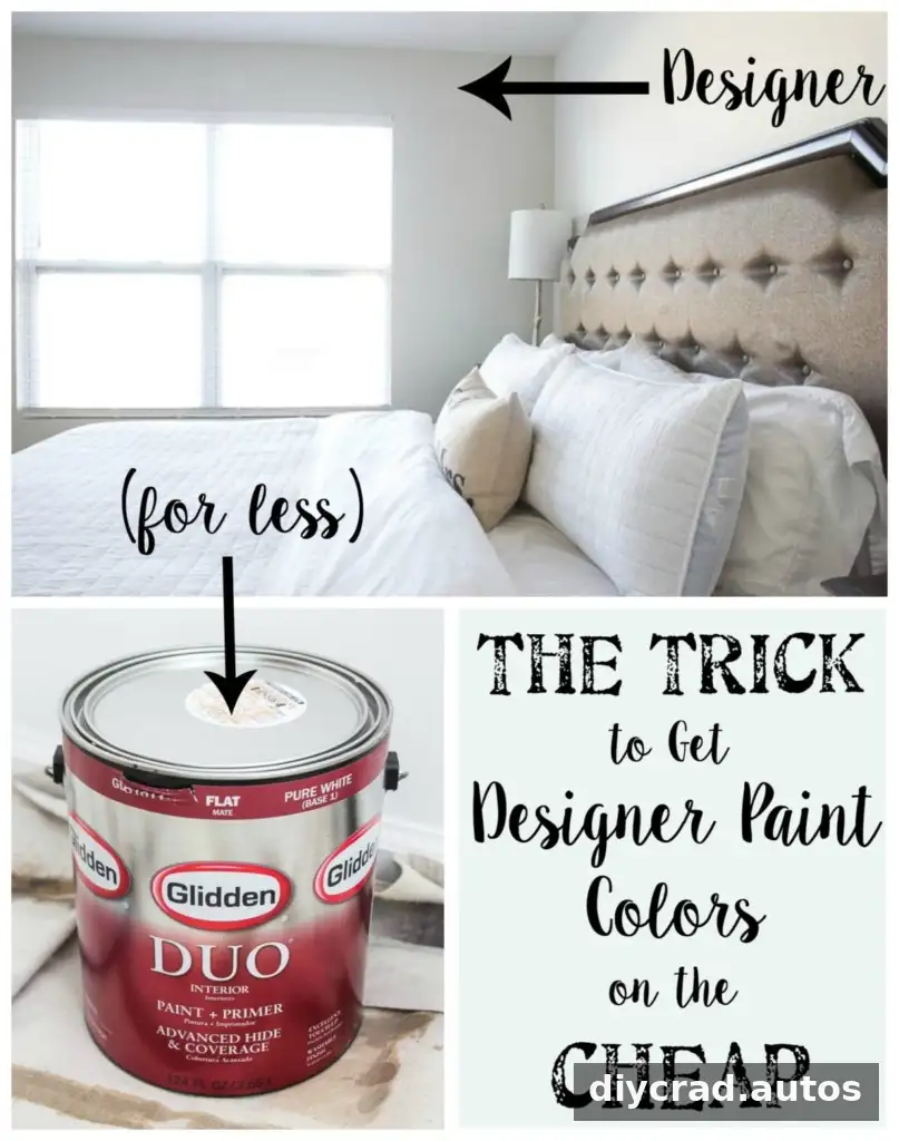
How to get designer paint colors at a lower price
Paint color names are not always limited to the brand printed on the can. Many paint counters can use a color reference from another brand to create a similar formula in a different paint line. For example, a Sherwin Williams or Benjamin Moore color may be requested in Glidden or Valspar paint, depending on the retailer and products available.
This is a request to formulate a color in another paint brand—not to physically combine two cans of finished paint. Give the associate the color’s brand and exact name, then ask whether it can be mixed into your chosen product. Color databases and store systems vary, so confirm availability before relying on a particular match.
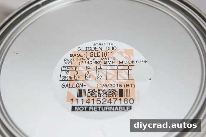
The original example used Glidden paint mixed to Benjamin Moore’s Moonshine. The Glidden option was about $22 less per gallon at the time, and rebates had sometimes reduced the cost further. Prices and promotions change, so compare current prices for the same quantity and finish before deciding.
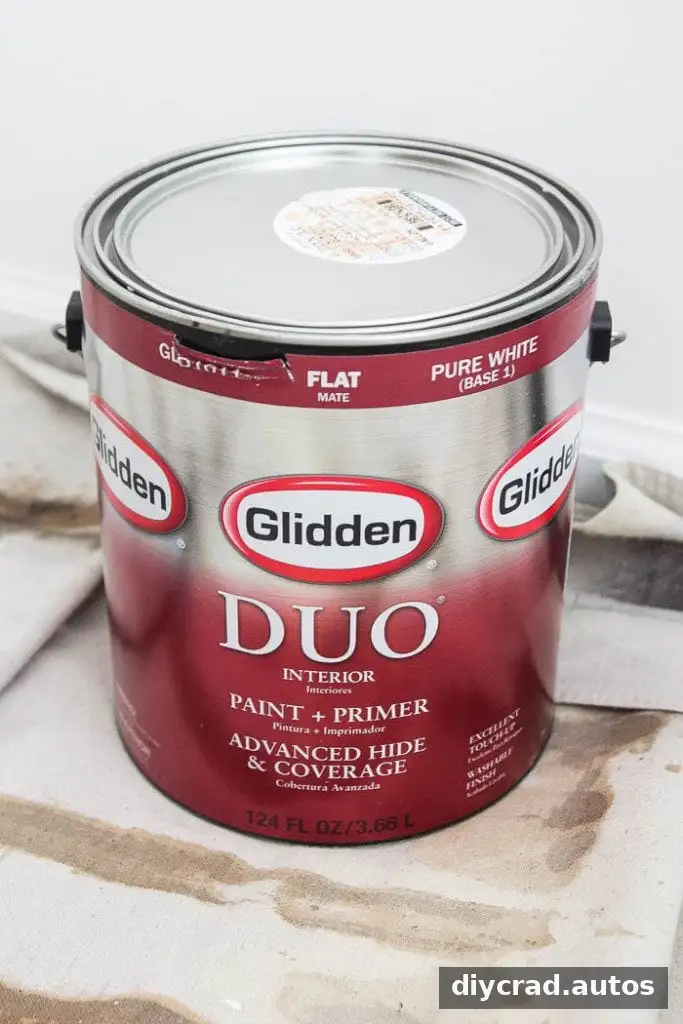
When comparing options, check the paint line, finish, and intended use—not just the color name. A less expensive paint may be suitable for a room while another product may provide coverage or durability that better fits the project. Ask the paint counter about the specific product, and consider buying a sample before committing to several gallons.
A whole-home palette of paint colors
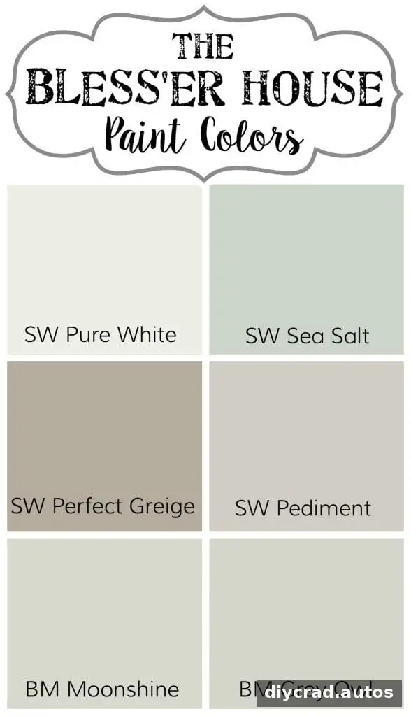
The shades below show how colors from different brands were used around one home. They can serve as starting points for your own palette, but lighting, nearby finishes, and the room’s orientation can affect how a color appears. Test a sample on the wall and view it at different times of day before painting the entire space.
Guest and kids’ bathroom
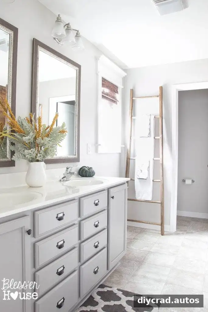
Sherwin Williams Sea Salt mixed in Valspar was chosen for its peaceful, clean appearance. It can shift between blue, green, and gray depending on the light. The bathroom cabinets are Benjamin Moore Winter Gates mixed into Valspar.

Master bathroom
Sherwin Williams Pediment mixed into Valspar is a light neutral with a balance of warm and cool tones. The cabinets use Benjamin Moore Winter Gates, matching the guest and kids’ bathroom cabinets. If coordinating rooms, compare samples together so their undertones work well side by side.
Office
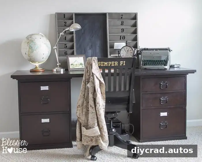
The office also uses Sherwin Williams Pediment mixed into Valspar. Using leftover paint from the master bathroom helped make use of an existing gallon. Before using leftover paint, check that it has been stored properly and that there is enough for the planned area.
Master bedroom
Benjamin Moore Moonshine mixed into Glidden provides a very light gray look described as peaceful and suitable for a bedroom. Pale shades can read differently under warm or cool bulbs, so check a sample with the room’s usual lighting.

Foyer
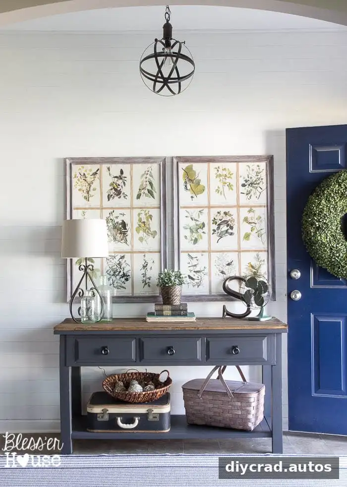
Sherwin Williams Pure White mixed into Valspar is used on the foyer walls and throughout the home for features such as a plank wall, trim, and fireplace. When choosing a white, compare it with the surrounding surfaces; subtle undertones can become more noticeable next to other whites.
Olivia’s bedroom
Benjamin Moore Grey Owl mixed into Sherwin Williams was selected during a 40% off sale. It is a light gray with a slight blue hint. Sales can make a higher-priced option more affordable, so compare promotional pricing with the cost of a comparable product in another brand.
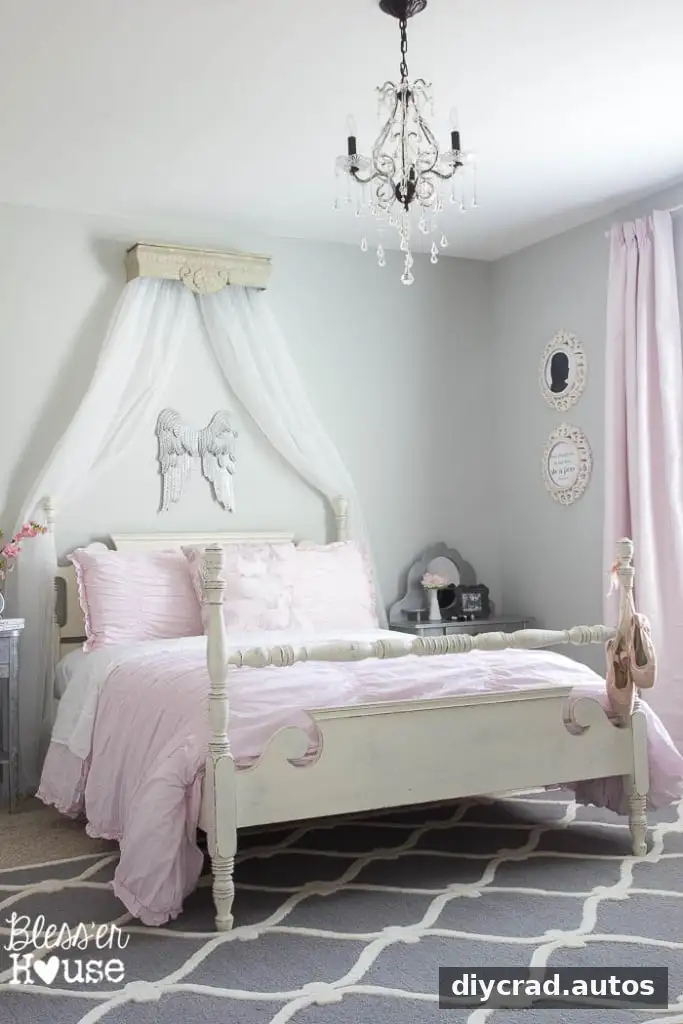
Dining room, living room, kitchen, and breakfast area
Sherwin Williams Perfect Greige was chosen quickly for the downstairs and turned out darker and more beige than expected, though it can appear gray as sunlight changes. The experience is a useful reminder to test paint before making a whole-floor decision. A small swatch may look different from a larger painted area, so review a generous sample in the room.
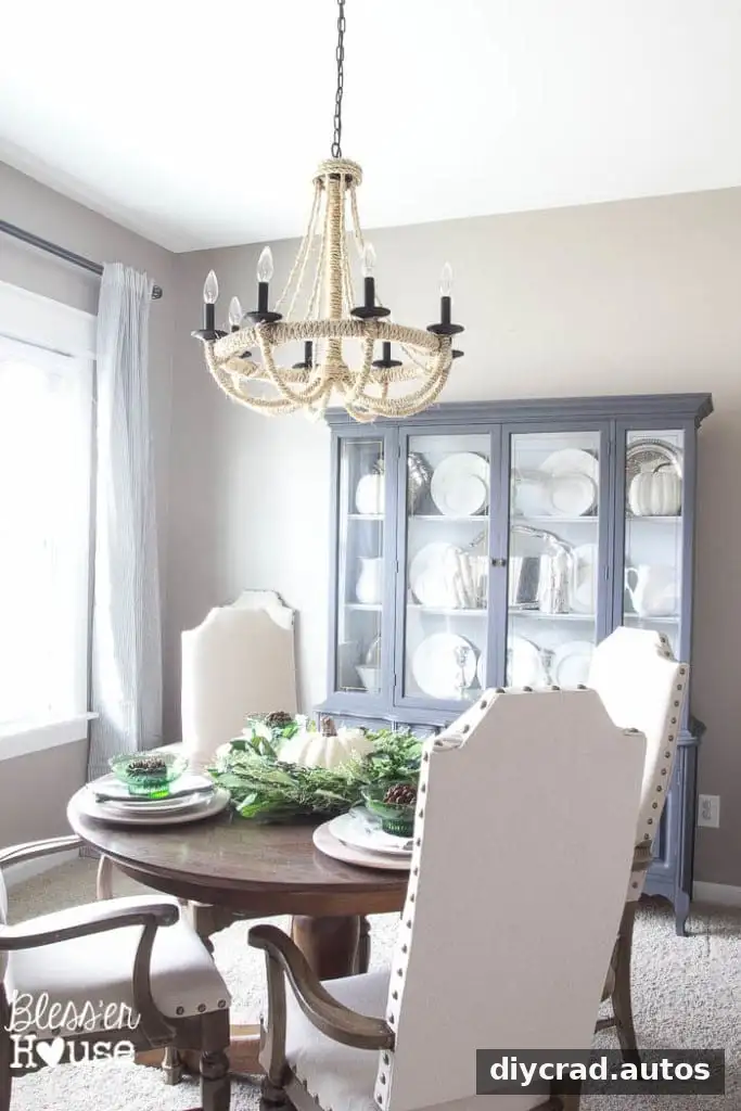
Perfect Greige is also used in the living room, kitchen, and breakfast area. The kitchen chairs are painted in Annie Sloan Duck Egg, adding a colored accent to the otherwise neutral palette.


Tips for choosing and ordering a color
- Write down the brand and exact color name before visiting the paint counter.
- Ask whether that color can be formulated in the paint line and finish you want.
- Buy a sample when possible and assess it in the actual room before ordering a full quantity.
- Keep the product label and formula details for future touch-ups; a color name alone may not capture the exact product or mix.
- Compare the total cost, including any current sale or rebate, rather than assuming one brand is always cheaper.
Using designer paint colors in a different brand can be a practical budget option, but color matching is not a guarantee of an identical result. Confirm the formula with the retailer, test the shade at home, and choose a paint product suited to the surface and room.