


Paint color mistakes often happen because a shade is chosen without considering how it will look in the room itself. A color that seems perfect on a small sample or in an online photo may appear different beside your flooring, furniture, and natural light. Testing carefully before painting can help you make a more confident choice and avoid unnecessary repainting.

Whether you are refreshing one bedroom or planning a larger decorating project, the key is to evaluate paint in context. These common missteps explain what to watch for and how to make the selection process more practical.
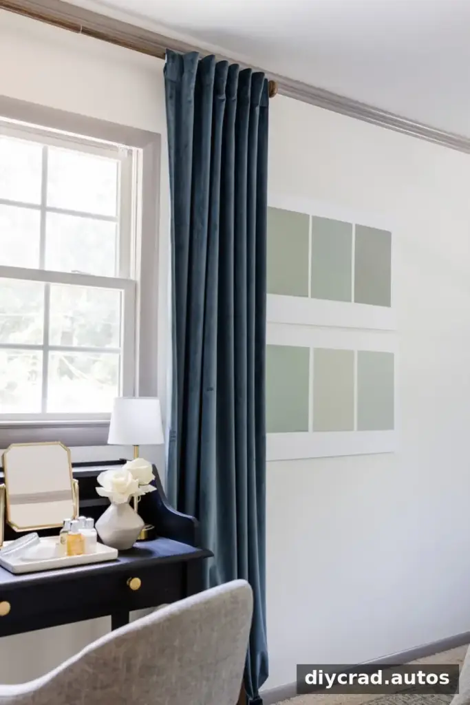
Paint Color Mistakes to Avoid
Many paint regrets are not simply about choosing an unattractive shade. They come from judging a color in the wrong conditions or too early in the decorating process. Use the following steps to see how paint behaves in your specific space.
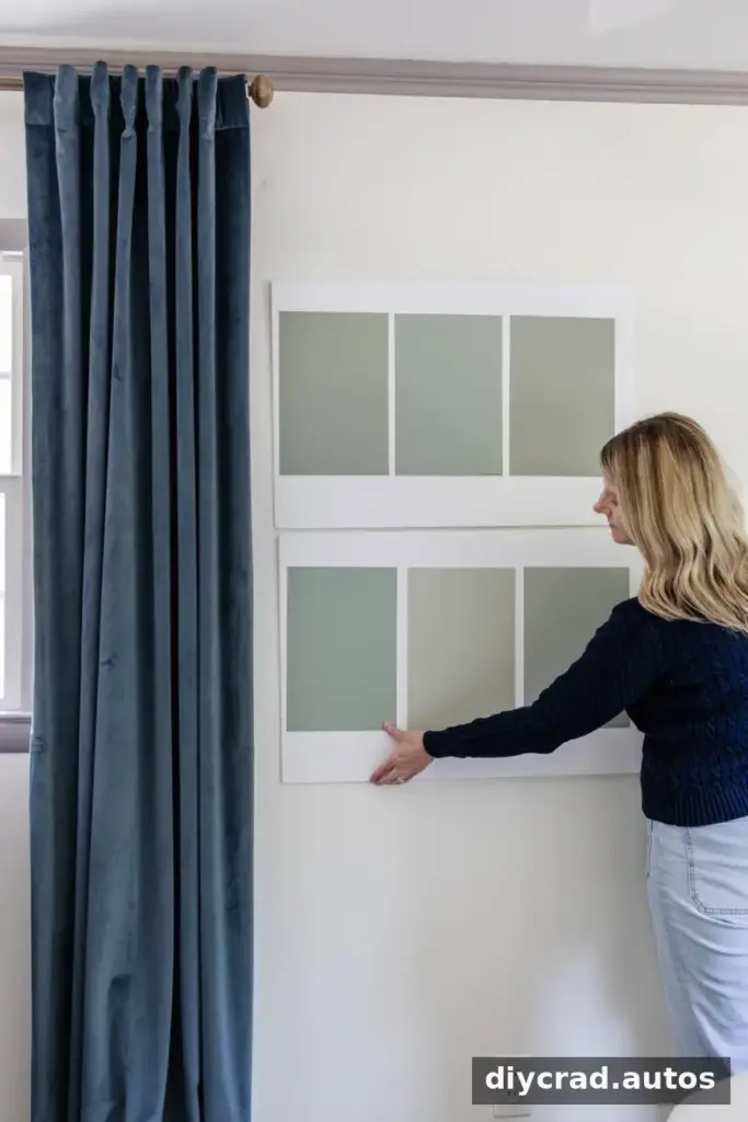
1. Relying on a small paint chip
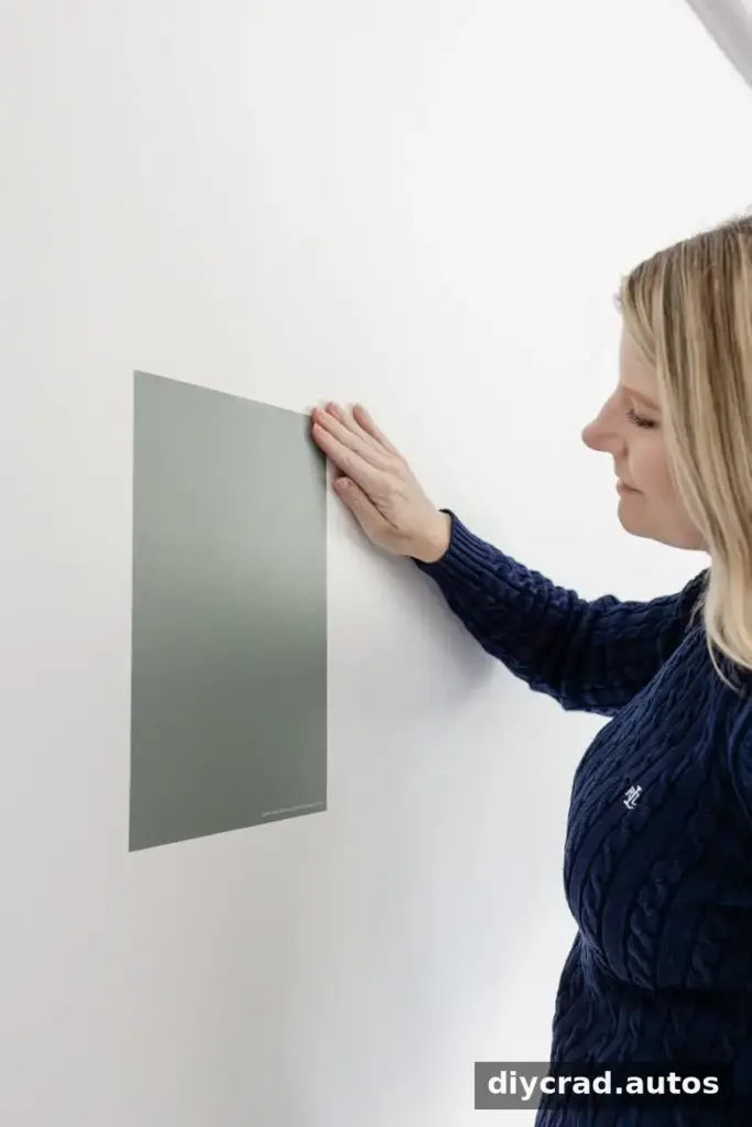
A small paint card is useful for narrowing down options, but it cannot show exactly how a color will look across a full wall. As the painted area gets larger, subtle undertones may become easier to notice, and the color can feel more prominent.
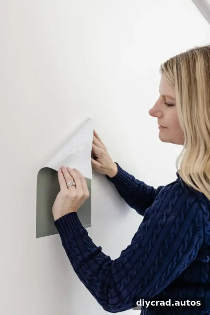
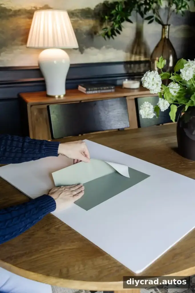
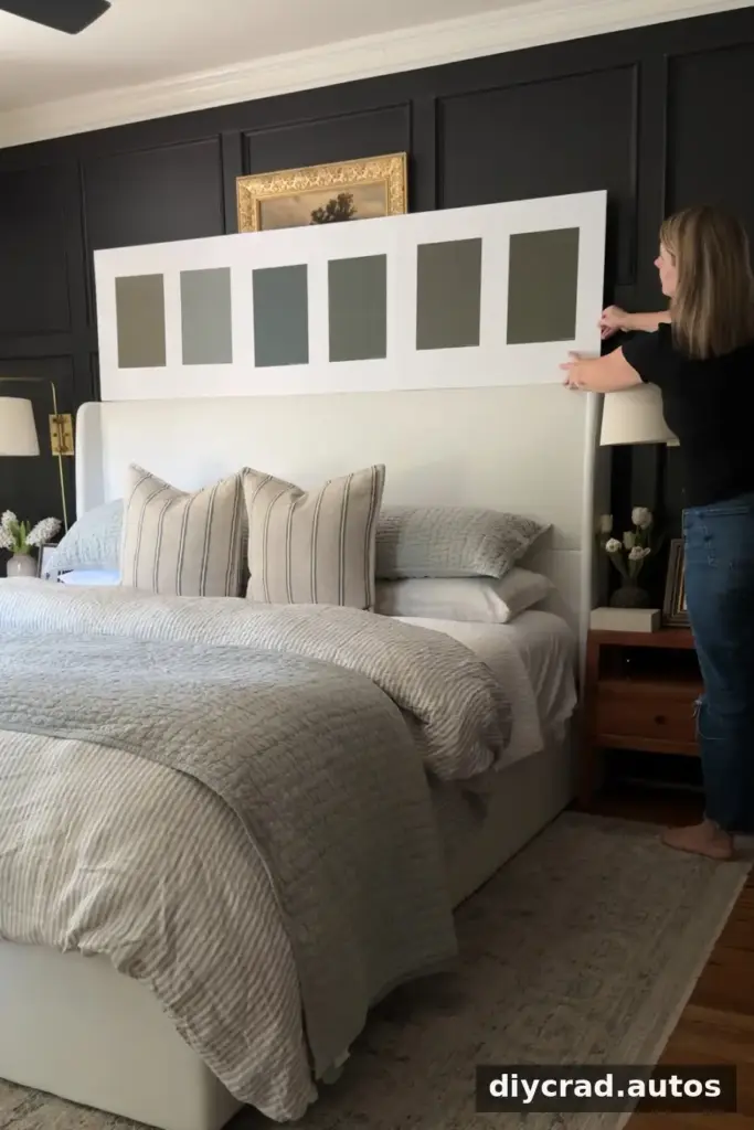
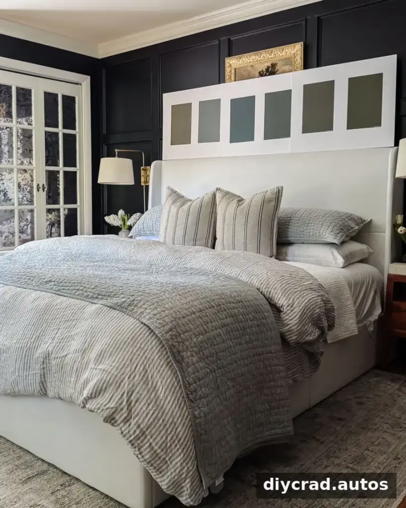
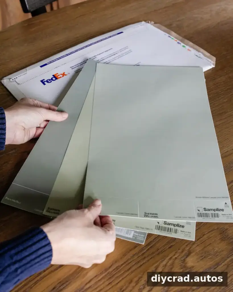
Before buying paint for the room, test a larger sample. Peel-and-stick samples or sample boards can be moved around without leaving painted patches on the wall. Place a sample near the floor, trim, and furniture to get a more realistic sense of how the shade works with the room.
Practical tip: Compare a few options at once, but avoid covering the room with too many samples. A short list makes differences easier to evaluate.
A sample board also makes it easier to test the same color on more than one wall. If you use a painted sample board, let the paint dry fully before judging it and follow the paint manufacturer’s directions for application.
2. Ignoring undertones
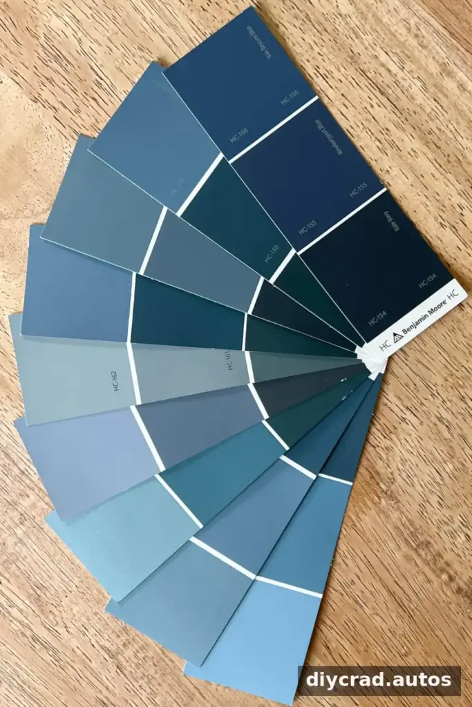
Paint colors often have subtle undertones that affect how they appear beside other surfaces. A gray may lean blue, green, or purple. White can look warm, cool, or slightly tinted depending on the light and nearby finishes.
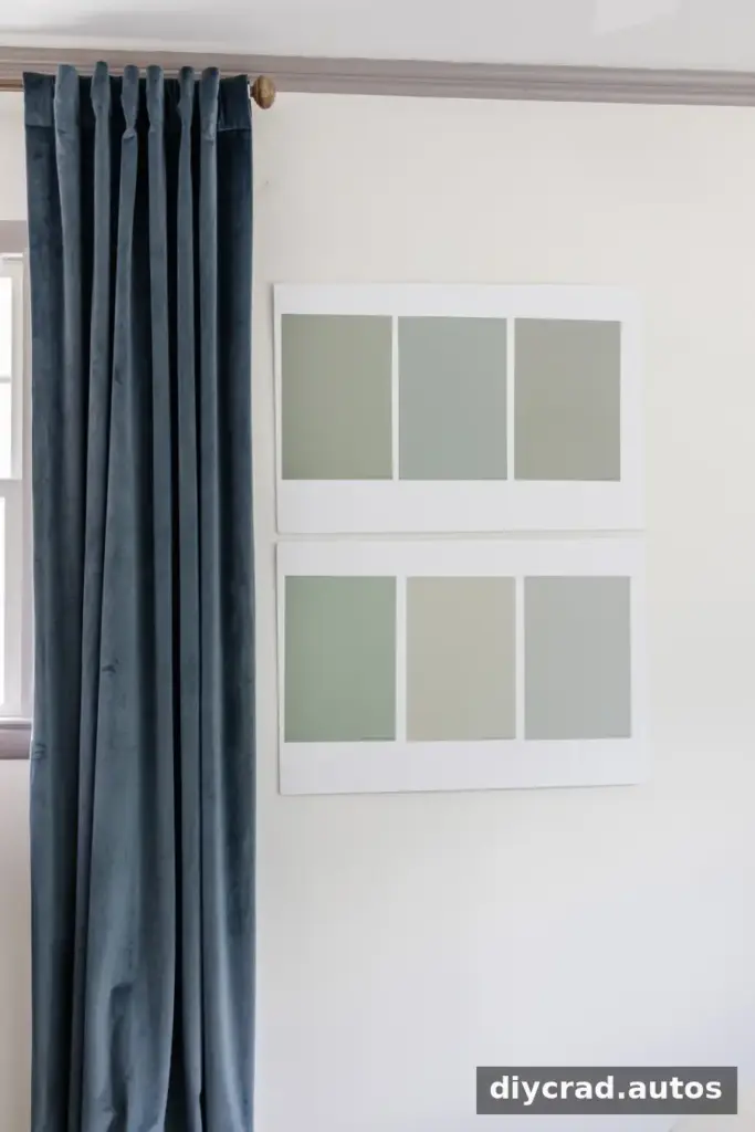
Compare samples side by side rather than evaluating each shade in isolation. You can also place them against a plain white background to make their differences easier to see. Remember that the surrounding wall color, furnishings, and decor can influence how your eyes perceive a sample.
Practical tip: If a neutral color seems unexpectedly cool or warm, compare it with a few alternatives before deciding. The contrast often makes its underlying cast more apparent.
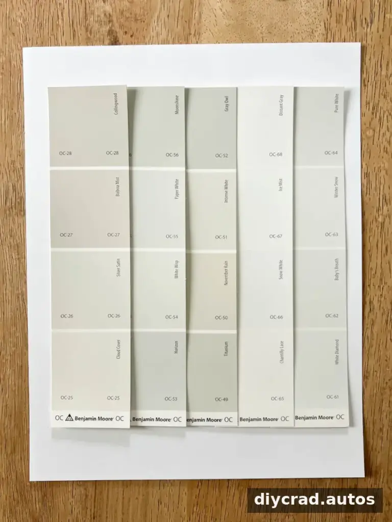
For a fair comparison, keep samples close together and view them from the same distance. This helps you focus on the paint rather than on changes in the room around it.
3. Checking color at only one time of day
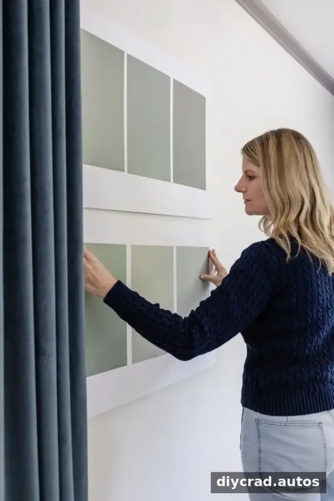
Natural light changes throughout the day, and artificial lighting can affect color too. A shade may look different in the morning than it does in the afternoon or evening. Weather, window direction, and the type of bulbs in the room can also influence its appearance.
Move your sample to different walls and observe it at several times of day. Check it in both daylight and the lighting you normally use at night. Online photos can offer inspiration, but they cannot reproduce the exact light and finishes in your home.
Practical tip: Give yourself at least a full day to observe a sample before making a final decision. If the room is used mostly in the evening, make sure you assess it under evening lighting as well.
4. Forgetting that flooring and fixed finishes matter
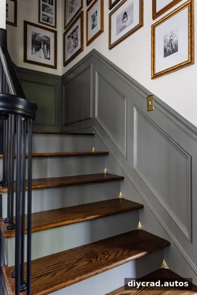
Flooring, countertops, tile, brick, cabinetry, and large furniture pieces all affect how paint appears. Their undertones can either complement a wall color or make it feel out of place. A shade that looks attractive on its own may clash with a warm wood floor or a cool-toned tile.
Take an inventory of the finishes that will stay in the room. Compare paint samples beside them, not just against a blank wall. A piece of white card stock can help reveal whether a surface reads warmer or cooler, though it is best used as a comparison aid rather than as a substitute for viewing the actual materials.
Practical tip: Photograph the samples beside the finishes in daylight and under your usual indoor lighting. The photos can help you compare impressions, but use the real samples for the final decision.
5. Choosing paint before the larger furnishings
Paint covers a large area, so it may seem like the first decorating choice to make. However, it is often easier to change than major purchases such as a sofa, rug, curtains, bedding, or countertops. Choosing those larger items first gives you more information about the colors your paint needs to coordinate with.
Once the key furnishings and finishes are selected, compare paint samples against them. This makes it easier to choose a wall color that supports the overall palette instead of forcing other decisions around a shade chosen too early.
Practical tip: If you already have paint in mind, keep it as one option rather than treating it as fixed. Let the room’s permanent elements guide the final choice.
6. Choosing a color only because it is trending
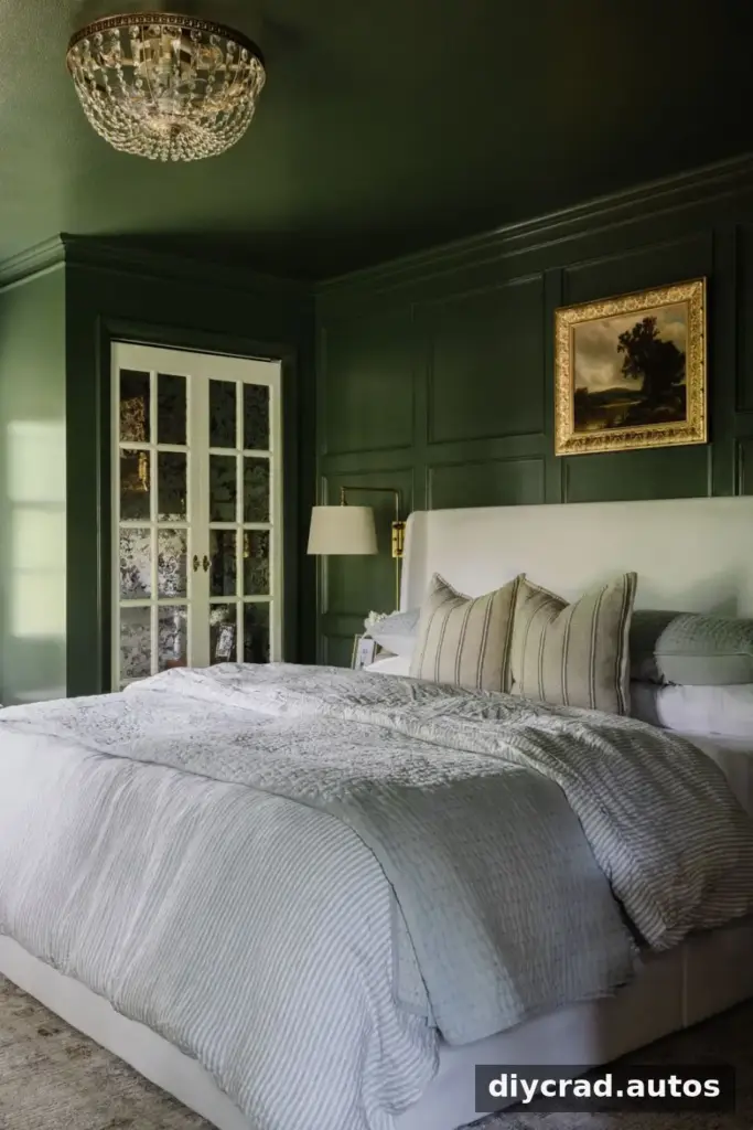
Color trends can provide ideas, but popularity does not guarantee that a shade will suit every home. The best option depends on the room’s light, architecture, existing finishes, and furnishings, as well as the atmosphere you want to create.
Use trends as a starting point, then test the colors in your own space. A shade that looks appealing in a styled photograph may feel very different in a room with different windows, flooring, or lighting.
Practical tip: Ask whether you like the color in your room and whether it works with what is staying. Those are more useful questions than whether it is currently popular.
A Simple Way to Test Paint Colors
Before committing to a full room, compare several samples and move them around the space. A portable sample board is useful because it can be placed beside flooring, trim, furniture, and other finishes without painting multiple test squares directly onto the walls.
Check each option on more than one wall and at different times of day. Keep notes about what you notice—for example, whether a shade looks warmer in the evening or more blue beside the floor. This makes it easier to distinguish a lasting preference from a first impression.
When you have narrowed the choices, review the paint product’s instructions and consider how the finish may affect the final appearance. If you are unsure, ask a paint professional about sample sizes and suitable preparation for your surface.
Conclusion: Avoiding Paint Color Mistakes
The most common paint color mistakes—trusting a tiny chip, overlooking undertones, checking a shade only once, and ignoring fixed finishes—can usually be avoided with a little preparation. Test samples in the room, compare them with the elements that will remain, and observe them in different lighting.
Taking time to evaluate paint before buying enough for a full room can help you choose a color that feels right in your home. A careful process is more reliable than choosing a shade based only on a trend, a store card, or an image online.

